TV Spatial Navigation
Very often, when developing user interfaces, a lot of focus is given to the visuals, as that’s what primarily gets a user’s attention. However, other aspects are equally impactful for making the experience great but can be overlooked, like the user’s input – how the user interacts with the app. It is completely understandable that it might go unnoticed; most of the time, the platform, say Windows for Desktop, iOS for iPhone or Android TV for your home Smart TV, handles it instead of the application’s developer. But what happens when this is not the case?
This is the situation our team found ourselves in. We develop the Spotify experience for big screens, like home TVs and gaming consoles. One instance in particular that turned out to be challenging but fun was TV spatial navigation.
What is spatial navigation?
Spatial navigation refers to the act of navigating the focus of your application to different elements in a two-dimensional view. This is generally done using the arrow keys of a TV remote control or the joystick of a gamepad for a gaming console. Unlike desktop applications, selecting an element with these controllers is less intuitive than with a mouse, where the movement of the cursor is simulated by the movement of the users’ own hands. Here, users have to move the focus in one of four directions until it arrives at the desired destination.
Shouldn’t spatial navigation be supported already?
Talking about spatial navigation and TV control might sound like a description of the keyboard and mouse; these inputs are developed by platforms, for the desktop or laptop. So it’s inevitable to think, “Shouldn’t the TV manufacturers provide this support as well?”
And yes, smart TVs do provide this support, but it only comes for free when developing a native application (that is, an application that uses the same technology as the manufacturer). For example, Android TVs use Android SDK, Apple TV has their proprietary software, and Roku TV created their own programming language, BrightScript.
Our team decided to take a different approach for building the Spotify client for TVs and gaming consoles, and we opted for a hybrid application instead of going fully native. In our case, all the applications for each TV manufacturer open a web application that will render the user interface. This choice gave us high versatility of using the same source code on multiple devices, but it came at the cost of losing some of the benefits that come with native applications.
Despite web browsers themselves being advanced software, there isn’t support for this functionality at the time of writing. There is a draft report called CSS Spatial Navigation Level 1, but it is expected to take a long time to be accepted and implemented.
Therefore, it was necessary to come up with our own solution, since this functionality wouldn’t be provided by the web browsers or TV platforms running the interface. Nonetheless, its implementation proved to be a very fun project, involving geometry and a few concepts from computer science.
Defining our requirements
Before jumping into the actual implementation, let’s define the primary cases:
Basic navigation
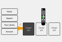
This is the Home view as it looks now:
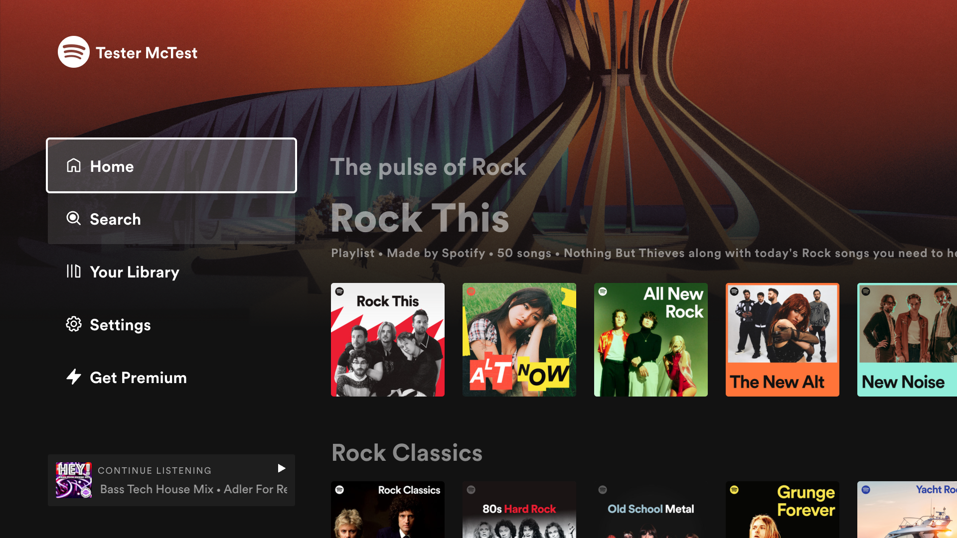
From this view, the application needs to mark only those elements that trigger an action, like navigating to a new view, marking an item as a favorite, or starting playback. After extracting them, we obtain a new view with the navigable elements only.
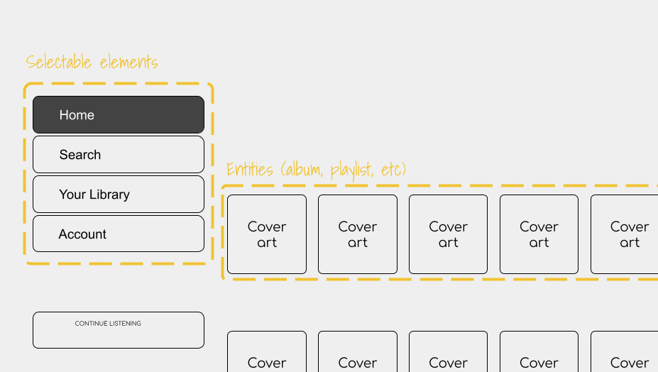
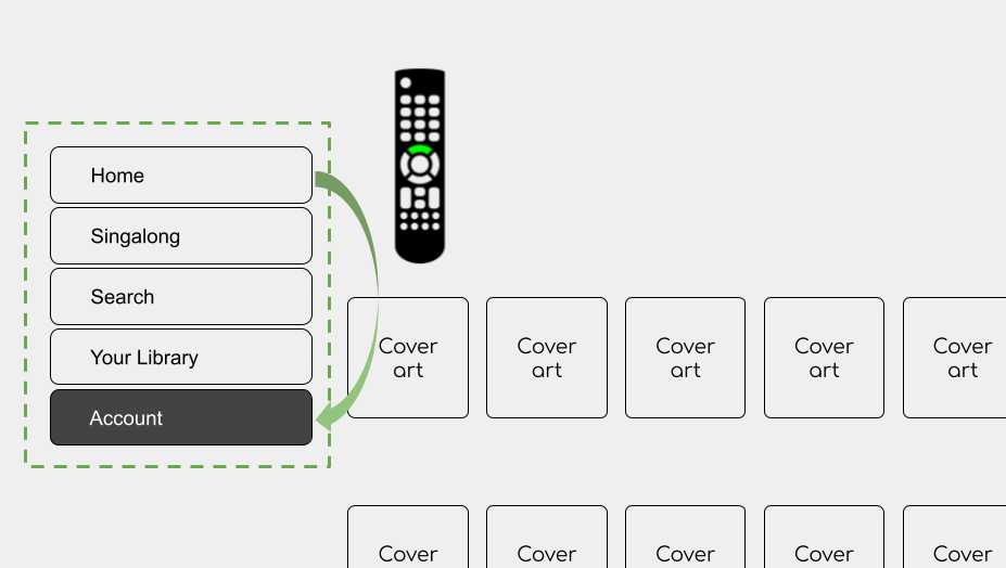
In this new view, the selectable elements are on the left menu. To the right are different entities such as albums, playlists, shows, etc., and selecting them will obviously take the user to the corresponding landing pages.
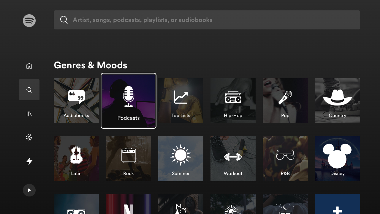
There are other slightly more complex views, like the matrix that is presented when users navigate to the Search view. Each tile represents a category of audio (and now video) content.
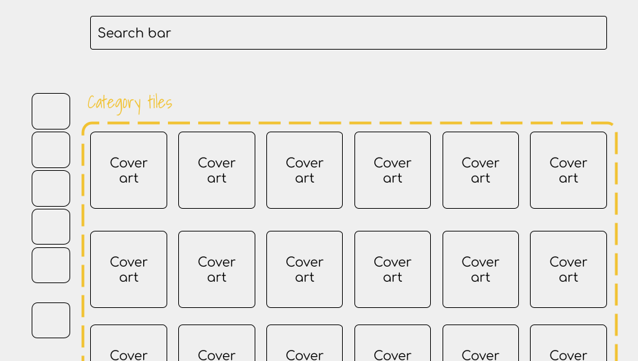
In these cases, users expect to navigate and meet boundaries where they cannot move any further, like hitting the bottom of a tracklist. However, in other cases, users expect no limits.
Cycle navigation
There are cases where it is more convenient to remove constraints and allow users to continue the navigation even when they reach the limit, like at the bottom of a menu. Clicking the down key will move the focus to the first item of the menu. We call this cycle navigation.
Block navigation in certain regions
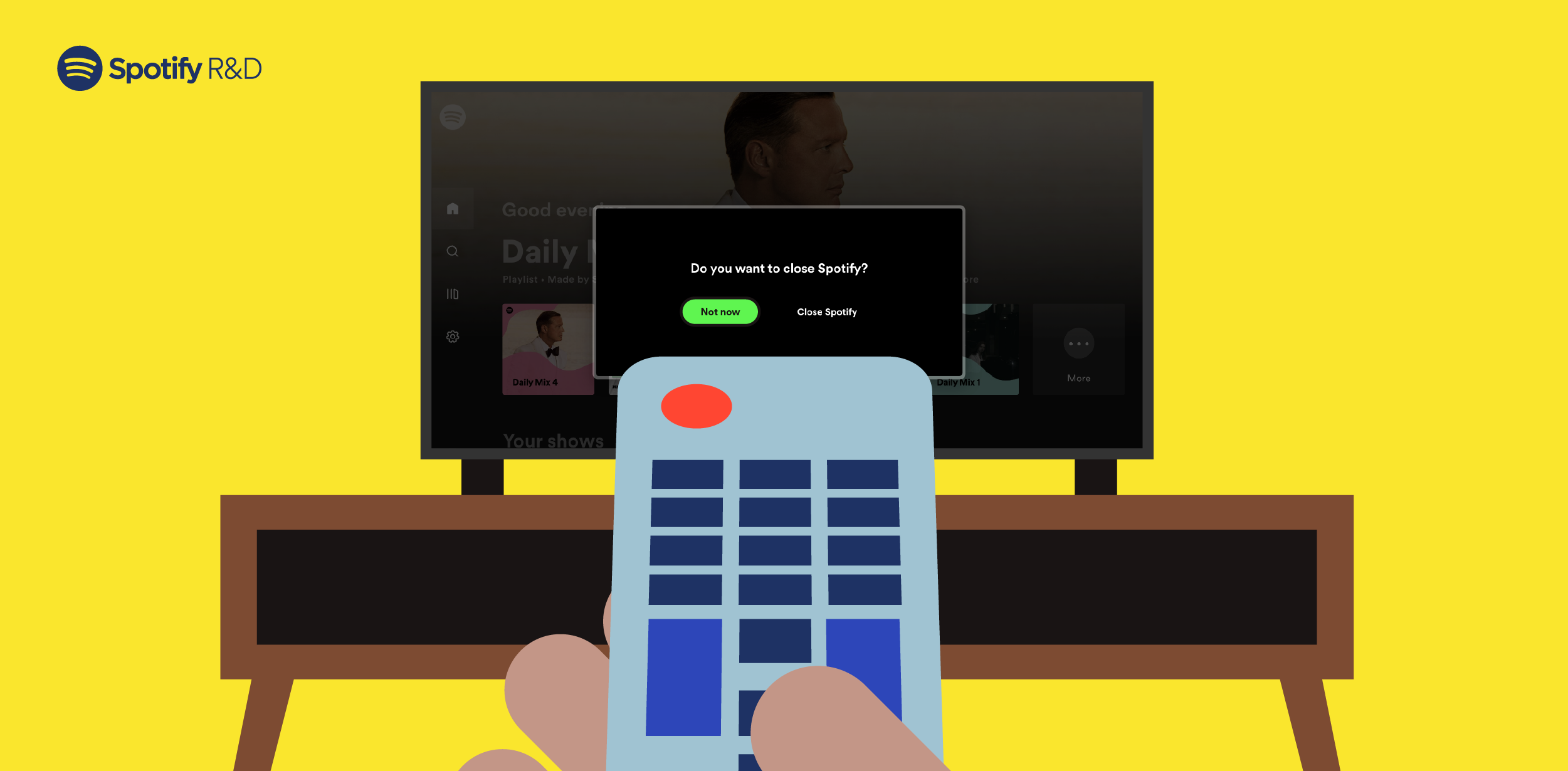
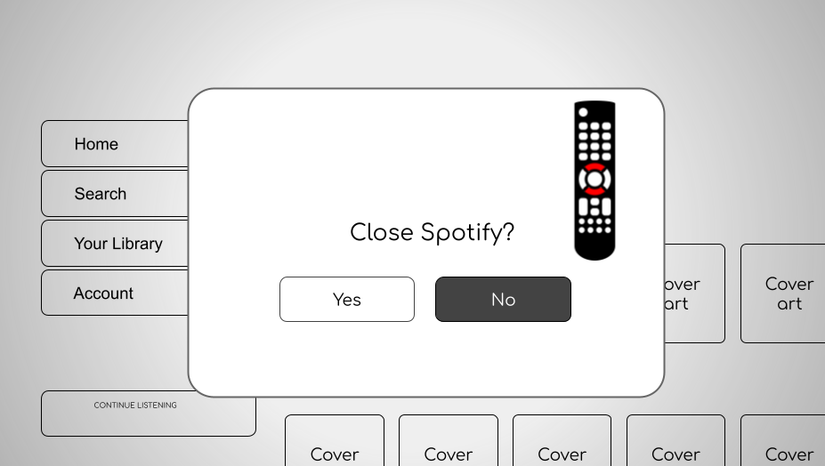
Finally, in other cases, it’s necessary to block all navigation and allow only the most prominent element to be selected (for example, when there is an alert and users are required to respond before moving forward, such as confirming to sign out). The navigable elements behind this alert window are still there, but they can’t be selected while this alert window is present.
Having defined all our needs, we can now jump into the solution mode. The evolution of this library is divided into two main parts outlined below, but in reality, it was a lot more complex than this super simplified characterization.
The first iteration: Naive approach
The term “naive” might not do this version justice, since many ideas from this phase were reused for the second iteration. Instead, the usage of this term aims to highlight the birth of this library.
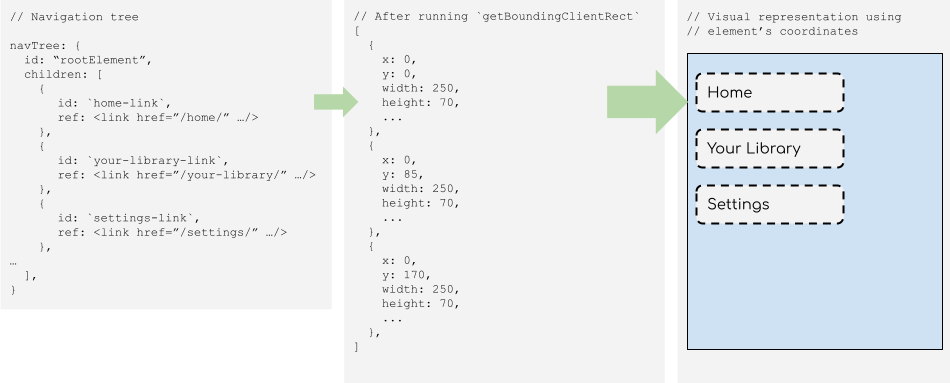
Before deciding where to go, one needs a map. In our case, a navigation map. Since our application was built upon React, it was logical to keep a representation of the navigable elements in memory, as that library also uses a similar approach with virtual DOM. The figure below illustrates how a page is represented as the navigation tree:
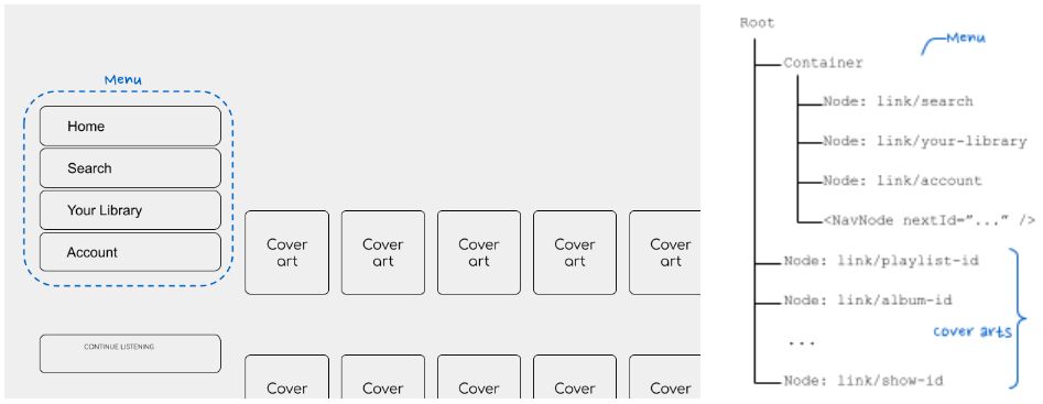
To implement this, new React components were created to categorize these types of nodes; that is, those elements rendered on the screen that can be selected by the TV control.
Navigable elements
In an analogy of a tree, this element can be considered the leaf. Every element that needs to be selected is contained inside a NavNode, and its responsibility is to register this element on the navigable tree, indicate which are the sibling “leaves,” and handle the selection when a user clicks the Enter key. To distinguish these elements from each other, each contains a unique ID (or navId), which is used to know where the focus will go.
<NavNode navId=”toplist-link” nextRight=”news-link”>
  <a href=”/playlist/123”>
    <img src=”/sweden-toplist-cover.png />
    <span>Sweden’s top list</span>
  </a>
</NavNode>
Container element
After the leaves comes the branch. This component (aka <NavContainer />) contains all those navigable elements that require special treatment, like menus, as explained above. It takes care of cases such as cyclic navigation or block navigation events from bubbling up through the DOM tree, if necessary.
<nav>
  <NavContainer navId=”sidebar-menu” cycle>
    <NavNode navId=”search-item”>
      <a href=”/search”>Search</a>
    </NavNode>
    <NavNode navId=”settings-item” nextTop=”search-item”>
      <a href=”/settings”>Settings</a>
    </NavNode>
    ...
  </NavContainer>
</nav>
<main>
  <h1>Good morning, User!</h1>
  ...
Root element
Finally, there is the root component (aka <NavRoot />), which sits at the top of the application. Its function is mainly to coordinate all the elements: register a new navigable element, dictate where the current focus lies, update it when it receives a navigation event, and update the navigation tree when users go to a new page.
function MyApp({ children }) {
  return (
    <NavRoot navId=”root”>
      <nav>
        <NavContainer navId=”sidebar-menu” cycle>
          <NavNode navId=”search-item”>
            <a href=”/search”>Search</a>
          </NavNode>
          ...
    </NavRoot>
  );
}
Limitations
Although this implementation fulfilled the basic role, it came with a few limitations, which can be observed already from the example above:
- The navigation logic is a manual process and thus error-prone. Developers need to state where the navigable element lies using
nextRight/Left/Up/Downattributes, and that was not always known. The same goes for thenavIdattribute, which needs to be unique. - The DOM tree of the page became more convoluted because of these wrapper components. While the extra elements were not necessarily a problem, they did make our development experience more confusing and difficult to debug.
- Finally, implementing this library required developers to have prior knowledge of the navigation process. For newcomers, this requirement made the onboarding experience slightly more complicated.
The second approach: A simple DX
With these limitations in mind, the goals for the next iteration were set to reduce the amount of knowledge the user of the library should have in two ways:
- Simplifying the API and thus its usage
- Reducing the coupling between the elements so they can be properly tested
Thanks to the introduction of Hooks in React 16.8, it was possible to encapsulate all the business logic into a function without requiring an extra component to contain the element that would be focused. Here is an example of how it was implemented:
Before…
function AcceptButton(props) {
  return (
    <NavNode
      navId=”ok-button”
      nextLeft=”more-button”
      nextRight=”cancel-button”
      focusable
      claimFocus
    >
      <button onClick={props.onClick}>
        OK
      </button>
    </NavNode>
  );
}
After…
function AcceptButton(props) {
  const { ref, isFocused } = useFocusRef();

  return (
    <button
      ref={ref}
      className={isFocused && ‘btn-focused’}
      onClick={props.onClick}>
        OK
    </button>
  );
}
The main highlights:
- No need for extra DOM elements! Thanks to the Hook function useEffect, it is possible to detect when a new component is mounted. Fewer DOM elements equals a better debugging experience.
- No more navigation logic! Instead, we only have a reference of the actual DOM element that can be focused, which will be returned by the Hook function.
And here is where the fun starts! Instead of letting users dictate how the navigation will be laid out, that responsibility falls on the library. This is possible to achieve thanks to the function Element. getBoundingClientRect from the DOM API; it provides the size and coordinates relative to the viewport.
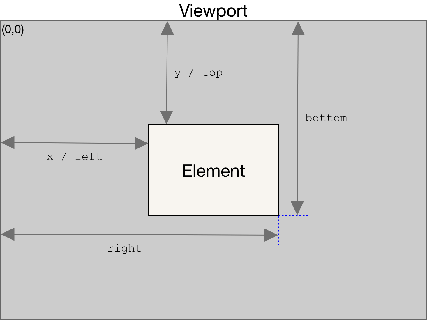
With this information in the navTree, it was now possible to recreate the same view with the navigable elements automatically. Using this view, we were able to determine what would be the next element selected according to the direction contained in the navTree, without adding extra elements to the DOM.
The second area for improvement was the coupling between the elements. It is probably evident in the section above that NavRoot was doing a lot: receiving the events from the user, dictating which element is currently focused, adding and removing elements to the navigable tree, etc. Thus, it was divided into three new modules with specific roles:
NavEngine:Keeping the navigable tree up to date
FindFocusIn: Keeping track of the current focused element
Navigate: Acting as the navigation motor, finding the next element that should be focused when users hit any of the arrow keys
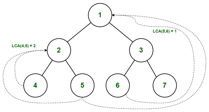
Personally, the latter module was the one that I found particularly interesting, as it uses some topics from computer science. Since the representation for focusable elements is a tree, it uses the lowest common ancestor algorithm to find the parent element. This is useful for cases like cyclic navigation where the parent element is involved.
Source: https://www.geeksforgeeks.org/lowest-common-ancestor-binary-tree-set-1/
Then there were other challenges that I enjoyed learning from, such as choosing the next element according to its dimensions, relative positions, and the direction of the selection. In most cases, this is trivial, as the user interface uses matrices or rows, but there are other cases where it is not super clear (for example, coming back to the navigation menu from the main view).
Trivial case…
…and not so trivial
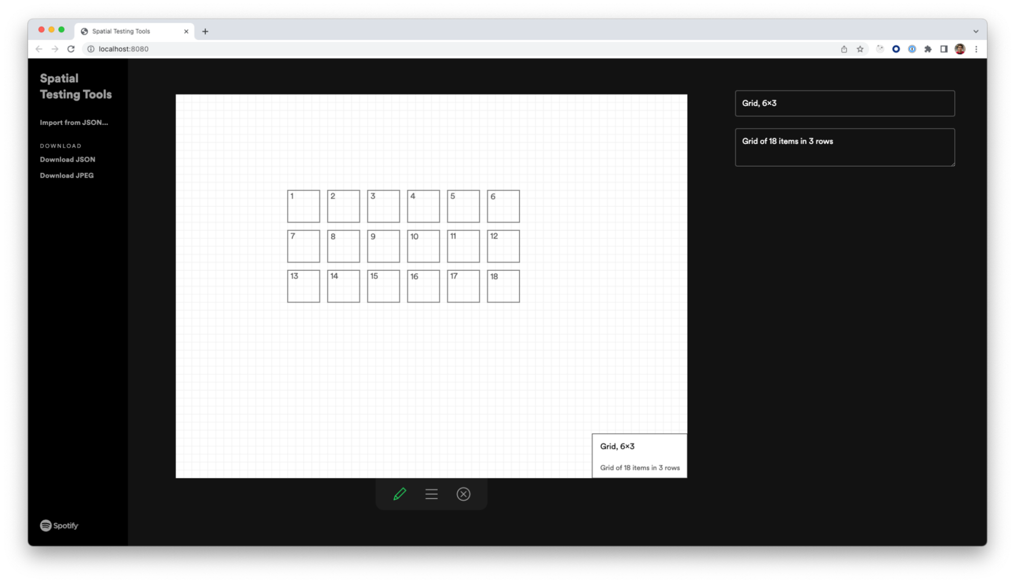
Building this business logic was not an easy task, especially if we wanted the ability to unit test it. To simplify the process, we were required to create a new project that would produce a representation of a navigable tree without running the application. The idea behind it was to present a drawing tool where users can simulate different scenarios of how the selectable elements will be positioned, and this tool would return a navigable tree in JSON format. This output would then be used as the input for the unit tests.
Conclusion and next steps
Having integrated the last version of this spatial navigation library in our application and not done any major updates, we can confidently say that it fulfills the basic need of providing an input that is easy for our users and easy to understand for the developing team. Our next step is to closely evaluate the potential performance costs, as Spotify continues to expand to more TVs. This aspect becomes crucial on low-end devices and those with different content formats.
Special thanks to Erin Depew, Daniel Lopes Alves, Dennis Gulich, Andreina Loriente and Yasa Akbulut. This post wouldn’t have been possible without their guidance and help.
Tags: backend

