


React component for entering PIN codes.
Live demo at https://soywod.github.io/react-pin-field/.
yarn add react-pin-field
# or
npm install react-pin-fieldimport PinField from "react-pin-field";type PinFieldProps = {
ref?: React.Ref<HTMLInputElement[]>;
className?: string;
length?: number;
validate?: string | string[] | RegExp | ((key: string) => boolean);
format?: (char: string) => string;
onResolveKey?: (key: string, ref?: HTMLInputElement) => any;
onRejectKey?: (key: string, ref?: HTMLInputElement) => any;
onChange?: (code: string) => void;
onComplete?: (code: string) => void;
style?: React.CSSProperties;
} & React.InputHTMLAttributes<HTMLInputElement>;
const defaultProps = {
ref: {current: []},
className: "",
length: 5,
validate: /^[a-zA-Z0-9]$/,
format: key => key,
formatAriaLabel: (idx, length) => `pin code ${idx} of ${length}`,
onResolveKey: () => {},
onRejectKey: () => {},
onChange: () => {},
onComplete: () => {},
style: {},
};Every input can be controlled thanks to the React reference:
<PinField ref={ref} />;

// reset all inputs
ref.current.forEach(input => (input.value = ""));

// focus the third input
ref.current[2].focus();The pin field can be styled either with style or className. This
last one allows you to use pseudo-classes like :nth-of-type,
:focus, :hover, :valid, :invalid…
Length of the code (number of characters).
Characters can be validated with a validator. A validator can take the form of:
- a String of allowed characters:
abcABC123 - an Array of allowed characters:
["a", "b", "c", "1", "2", "3"] - a RegExp:
/^[a-zA-Z0-9]$/ - a predicate:
(char: string) => boolean
Characters can be formatted with a formatter (char: string) => string.
This function is used to generate accessible labels for each input within the
<PinField />. By default it renders the string pin code 1 of 6,
pin code 2 of 6, etc., depending on the actual index of the input field
and the total length of the pin field.
You can customize the aria-label string by passing your own function. This can
be useful for: i) site internationalisation (i18n); ii) simply describing
each input with different semantics than the ones provided by react-pin-field.
onResolveKey: when a key passes the validatoronRejectKey: when a key is rejected by the validatoronChange: when the code changesonComplete: when the code has been fully filled
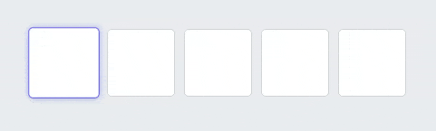
See the live demo.
git clone https://github.com/soywod/react-pin-field.git
cd react-pin-field
yarn install
To start the development server:
yarn startTo build the lib:
yarn buildTo build the demo:
yarn build:demoUnit tests are handled by Jest (.test files)
and Enzyme (.spec files).
yarn test:unitEnd-to-end tests are handled by Cypress
(.e2e files).
yarn start
yarn test:e2e
![@dependabot[bot]](https://avatars.githubusercontent.com/in/29110?s=64&v=4)