
What Are Microinteractions?
Many of our everyday interactions with computer systems fall under the large umbrella of microinteractions. Microinteractions provide feedback to the user, often through conveying system status or helping users prevent errors. Additionally, microinteractions can be used as a vehicle for branding.
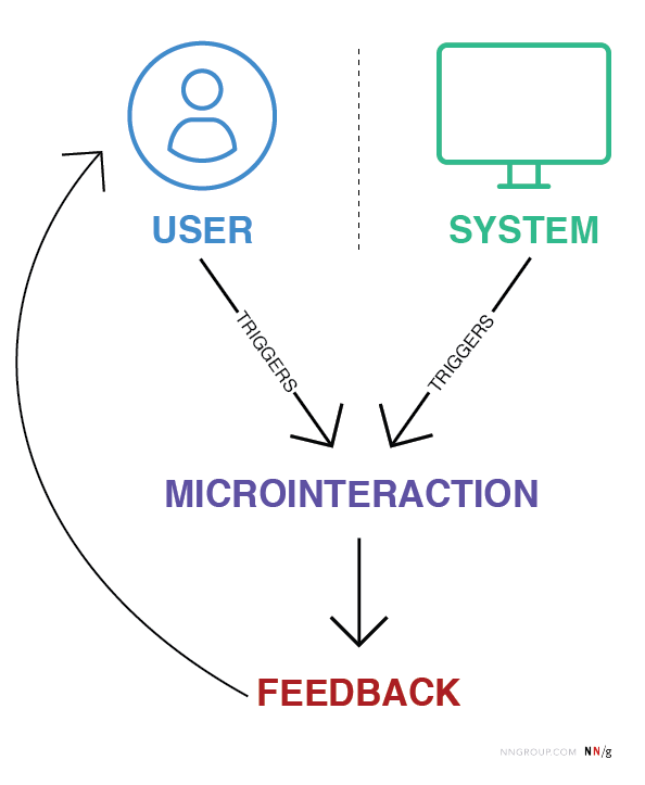
Definition: Microinteractions are trigger-feedback pairs in which (1) the trigger can be a user action or an alteration in the system’s state; (2) the feedback is a narrowly targeted response to the trigger and is communicated through small, highly contextual (usually visual) changes in the user interface.
User-initiated triggers can consist of a GUI command or can be gestural or voice-based, whereas a system-initiated trigger involves meeting a set of predetermined conditions. When a microinteraction is triggered by a GUI command, a visual feedback element will be usually placed in close proximity to that trigger.
Microinteractions encompass a substantial number of digital elements, but not every element is part of a microinteraction. Static elements that are always present on the screen are not microinteractions because they do not have a distinct trigger. Additionally, flows composed of multiple actions are not microinteractions. Some examples of microinteractions are described in the table below.
|
Digital element |
Is it a microinteraction? |
Reason |
|
Scrollbar |
Yes |
User triggered; visual feedback to user changing location within a page |
|
Digital alarm |
Yes |
System triggered; auditory (and visual) feedback to time condition being met |
|
Button |
It depends |
If there is no feedback when a user clicks the button, there is no microinteraction |
|
Pull-to-refresh animation |
Yes |
User triggered; visual feedback to a user action |
|
GIFs |
No |
Not triggered by the system or a user |
|
Swipe animation |
Yes |
User triggered; visual feedback that a user has swiped an element |
|
Email notification |
Yes |
System triggered; provides user with feedback that a new message has arrived |
|
Video player |
No |
Feature, not a microinteraction; volume control within the video player would be a microinteraction |
In 2014, Dan Saffer published the book Microinteractions, which defined this concept and outlined a model for designing microinteractions.
In this article, we focus on why microinteractions are important to the user experience and provide several examples from the user’s perspective.
Why Are Microinteractions Important?
One of the greatest joys of using technology comes through user empowerment and engagement. An enjoyable experience means more than just usability — it needs to be engaging, and that’s where microinteractions can play a macro role, by positively contributing to the look-and-feel of a product or service.
Microinteractions can improve a product’s user experience by:
- Encouraging engagement
- Displaying system status
- Providing error prevention
- Communicating brand
Standard microinteractions such as scrollbars are less likely to be poorly designed compared to their modern counterparts like pull-to-refresh elements. It is these new microinteractions that require more effort and thought to create a meaningful, well-designed experience.
Let’s walk through a quick case study of a microinteraction done well.
To keep track of day-to-day tasks, I use the task-management tool Asana. There are a few aspects of the tool that I especially enjoy, like the tags and the visual design. But by far, my favorite aspect of Asana is the sporadic flying unicorn that soars across my browser when I complete a task. This interaction is an example of a microinteraction.
When a user marks a task as complete, a small dialog box appears in the bottom left corner of the page. This dialog provides system feedback that the task has been marked completed and an error-prevention option to undo this action in case it was a mistake. About a split second after this box appears, a unicorn flies across the bottom left quadrant of the browser in celebration of a job well done. In this case, there are two microinteractions: the utilitarian dialog box and the gamification-inspired unicorn animation.
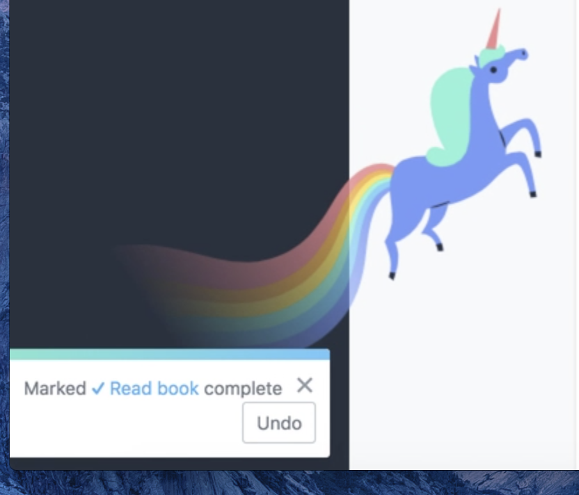
If you’ve ever used a task-management tool, you probably know that there are a lot of options to choose from — Asana, Jira, Trello, or Wrike, to name a few. These products have a lot in common. They share features like the ability to assign tasks to team members, create boards, or integrate with other products. However, the differences between these products become quite clear when analyzing the microinteractions embedded throughout the experience. In Trello, moving a task to the Done column generates no extra fanfare. And, for many people, that perfectly meets expectations. Me, I crave the positive reinforcement of completing a task and hoping that I see the unicorn.
However, microinteractions do more than just make users feel good. Microinteractions convey system status, support error prevention, and communicate brand. These use cases add significant value, thereby making microinteractions a key way to differentiate your product from competitors. Microinteractions provide feedback to keep users informed and engaged, and without them, your customer experience will suffer.
Show System Status
The first usability heuristic focuses on the visibility of system status. This heuristic reinforces the need to be transparent with the user. By being transparent and communicating the current state of the system, users will feel empowered and engaged. Any display of system status is a microinteraction because the interaction naturally includes a trigger (either a user action or a change of system state) and feedback.
Communicate Progress
Progress indicators, a subcategory of microinteractions, let users know that the system is still working to respond to their actions. They can show a specific or undetermined wait time and may include components like linear or circular progress indicators. Such elements encourage the user to remain committed to a product while they wait for something to happen.
LinkedIn uses circular progress indicators when users pull-to-refresh their newsfeed. This component communicates that the system is working so that users don’t second-guess whether the system recognized their action. Due to this microinteraction, users are likely to (briefly) wait for more posts to load and thereby continue to engage with LinkedIn.

Standby
Sometimes systems need to communicate that they’re waiting for further user input. After the initial trigger, microinteractions notify the user that the system is in standby and needs additional information. This type of microinteraction encourages the user to continue interacting with a product.
For example, in iOS, when you press and hold an app icon on the device’s home screen, the system responds by slightly shaking all of the apps. This movement communicates that the system is waiting for further action (that is, either tapping the ‘X’ in the top-left corner of the app to delete it or dragging the icon to a different position on the screen in order to move it).

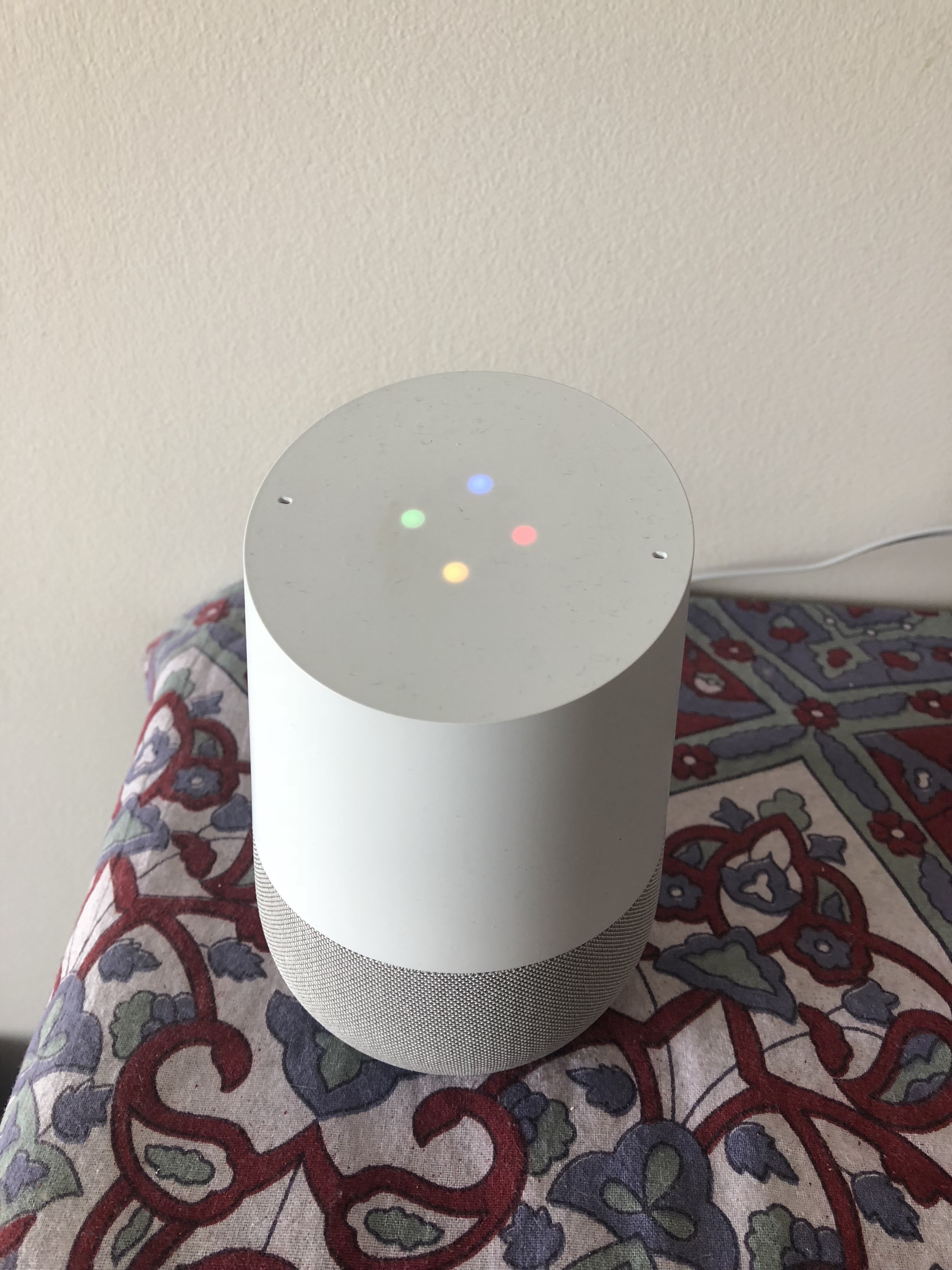
Microinteractions aren’t limited to websites. Voice-based assistants such as Google Home use microinteractions to communicate standby mode when waiting for a user command. After the user says, ‘Hey Google,’ the device displays a circular animation of four dots. Almost instantly the dots form the shape of a diamond with a subtle flickering motion. Through this visual feedback, the user knows that the device is listening and can follow up with a question such as ‘What’s the weather like?’
Error Prevention
Error prevention, another one of the 10 usability heuristics, focuses on getting rid of error-prone situations and providing confirmation actions. Microinteractions communicate these situations to users and can facilitate a satisfactory experience by supporting undo and preventing rework.
Support Undo
Everyone makes mistakes and, in the digital world, this means that sometimes we click things by accident. Systems should make it easy to undo actions so that users don’t have to jump through hoops to reverse something that they didn’t mean to do in the first place. Microinteractions communicate the state of a UI component and suggest that further interaction is possible. Microinteractions are the perfect way to support undo because they inform the user that a change in state has occurred.
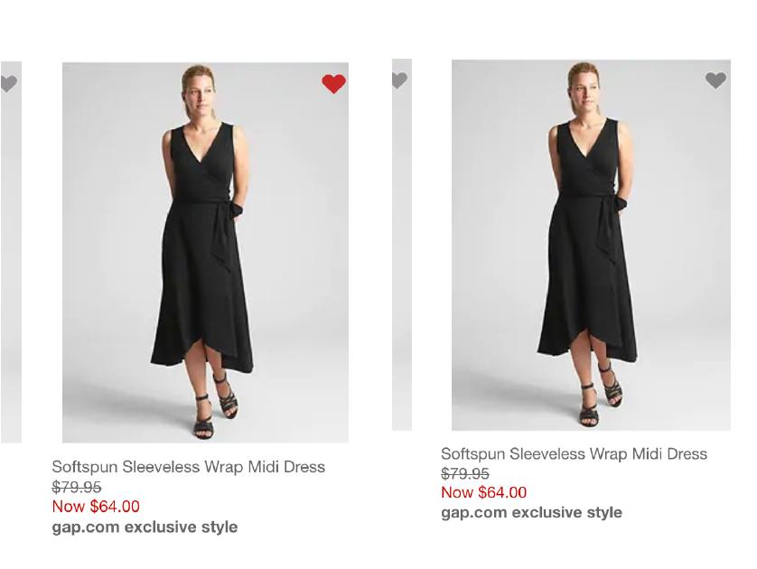
Gap.com allows you to add items to your favorites by clicking a heart icon in the upper right-hand corner of the product image. This microinteraction uses a pumping-heart animation to communicate that you’ve ‘favorited’ the product. You can easily undo this action by clicking again on the heart icon, which will then revert back to its original grey state.
This pulsating heart is an appropriate use of animation to draw attention, for multiple reasons:
- It’s subtle enough to not brutally yank the user’s attention away from the primary task. (In contrast, an aggressive animation would be too intrusive.)
- By only animating the heart for a short duration, this effect remains a microinteraction, as opposed to being inappropriately permanent.
- The distinction between the pumping heart and the “regular” colored heart (from previously favorited items) is helpful in communicating the change in system state and directing the user’s attention to the effect of a potential accidental activation (something that’s sadly all too common in touch-driven user interfaces).
Prevent Rework
In the account-creation process, there are few things more frustrating than clicking the final submit button and receiving an error that your password does not meet requirements that were not previously specified. Microinteractions communicate to users whether their password meets all field requirements and prevent repeat work (i.e. filling out the form again). Without these microinteractions, users get annoyed with the product and, if the task isn’t critical, likely disengage altogether.
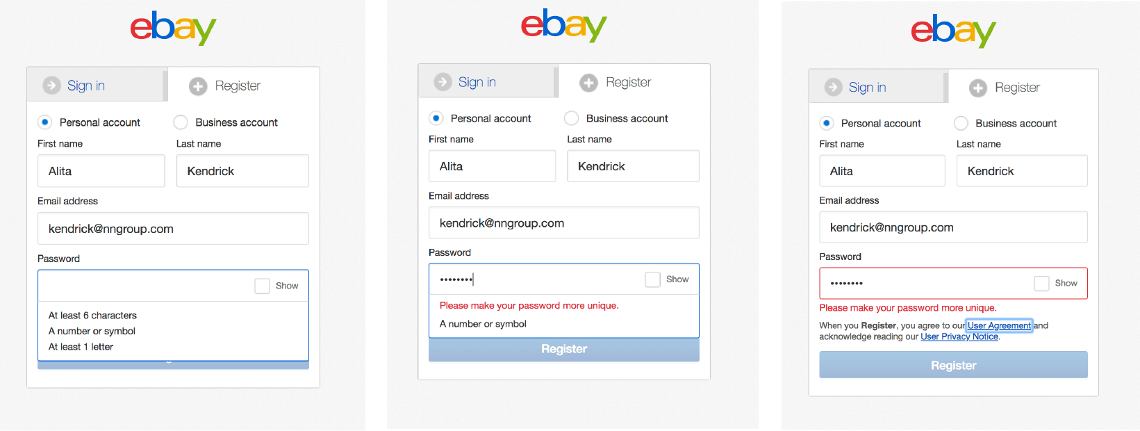
eBay uses microinteractions in the registration form to prevent validation errors. For instance, when the password field is active, a list of password requirements appears. While typing, as the password meets each of these requirements, the list updates dynamically. If the field is left without meeting all requirements, a red error message appears under the field. This series of microinteractions works together to ensure users receive consistent feedback and have a smooth experience.
Communicate Brand
Microinteractions shouldn’t be fluffy and should always serve a purpose — but that doesn’t mean that they shouldn’t embody a brand. If your branding is fun and colorful, it’s okay to let that show in your microinteractions. Alternatively, if your brand is professional and reliable, using something comical, like a donut, in your pull-to-refresh microinteraction is ill-advised. Just as your copywriting has a tone of voice, your microinteractions have a tone as well. (A good example of brand as experience.)
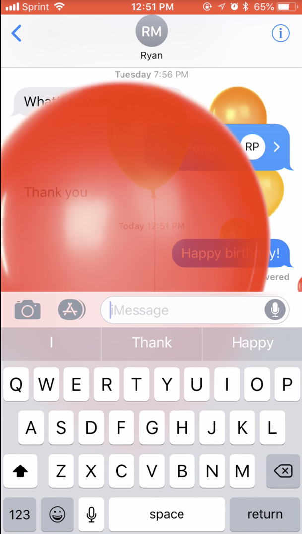
When sending a happy-birthday text message on Apple’s Messages app, balloons fill the screen. Apple presents itself as an innovative yet humanistic brand; the birthday microinteraction is in line with this personality by creating an emotional and sensory experience.
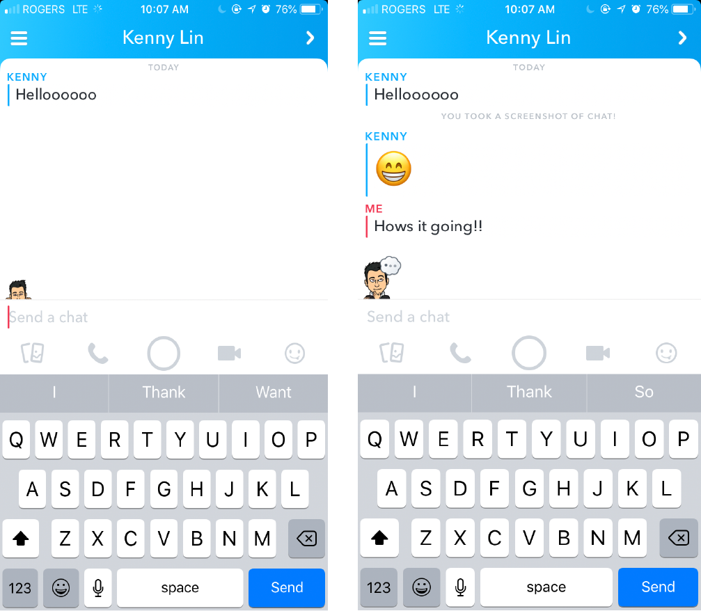
In Snapchat, microinteractions are used to communicate that two Bitmoji users are in the same chat window. When your chat partner is typing, his Bitmoji appears with a thought bubble. If he’s reading the message, his Bitmoji peaks over the text-input field. In this case, the feedback provided encourages users to continue the conversation and stay engaged with the app.
Many brands rely heavily on visuals to communicate to us, but sound can be just as powerful. If you were asked to draw the logo of an insurance company versus sing their commercial jingle, which would be easier? If you watch a lot of television, the jingle will likely come to mind first. Microinteractions can involve auditory responses as well. For example, the Xbox One console provides auditory and visual feedback when a user turns the system on: the Xbox button illuminates, and the system emits a short, characteristic melody. Owners of Xbox One can likely differentiate this sound from the Xbox’s system-off tune, as well as from other gaming platforms’ sounds. This microinteraction is a signature element of the interaction with the system as well as of the Xbox brand.
Conclusion
Well-designed microinteractions can make a big impact on your user experience. They provide value by serving as a vehicle to communicate with the user. Microinteractions provide visual feedback of the system status or help users to prevent errors. Additionally, microinteractions can enrich your product by communicating brand, which thereby encourages users to select your product over your competitors. In sum, these little details can transform a good product into a great product, and disengaged user into an engaged user.
Reference
Saffer, D. (2014). Microinteractions. O’Reilly Media.


