A Quick Guide to Dropdown Menus With React

You probably encounter even more dropdowns than you realize. Let’s explore some of the types of dropdowns you can use when building your next React application.
Dropdowns are a feature common to many websites. They are very useful, as they make it easy to show additional data only when it is needed. For instance, if we want a user to select their country of origin, a list of countries won’t be visible until a user clicks on the country dropdown. Another good example is autocomplete functionality. When a user is searching for an item, you can display a dropdown with a list of suggestions that can help complete the search faster.
Let’s explore some of the types of dropdowns you might make use of in your application.
Types of Dropdowns
You probably encounter a bunch of dropdowns in your daily life, whether or not you think much about them.
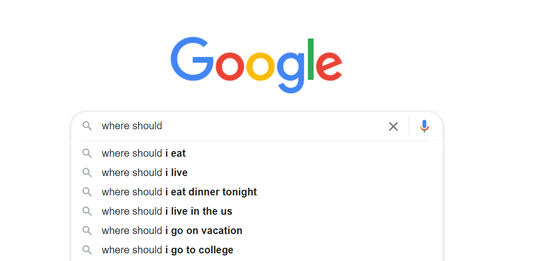
For instance, using the Google search bar will bring up an autocomplete dropdown:
Similarly, YouTube uses an autocomplete dropdown to show suggestions for videos:

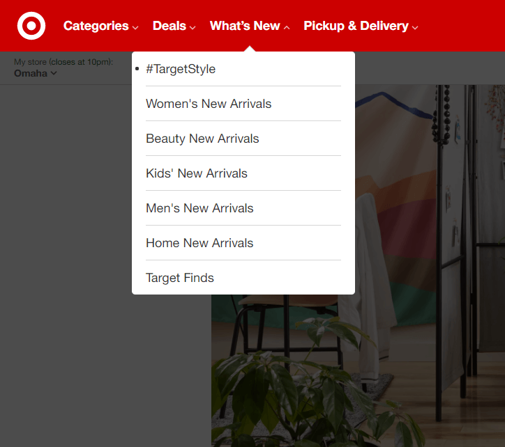
Autocomplete is not the only functionality for which dropdowns are used. For instance, a lot of websites utilize dropdowns for their navigation, like Target:
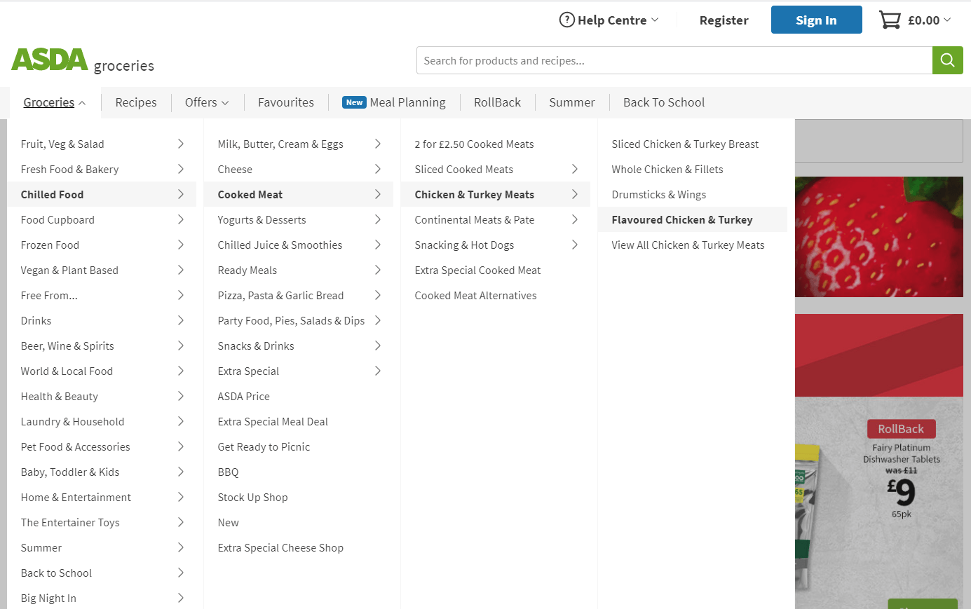
If a simple navigation dropdown wasn’t enough, there are websites that incorporate mega-dropdown menus. These are often used by e-commerce websites that may have a lot of links for categories and products. One of them is Asda:
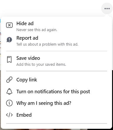
Another example is a context dropdown menu. Facebook uses it to provide users with post-related actions:
There are many more dropdown examples, but now, let’s take a look at how to implement some real-life examples in your code.
Building With Dropdowns
In this article, we will cover multiple React dropdown and form components examples. I will be using KendoReact, which provides a number of very useful and feature-rich components. We will implement dropdown menus and select components for real-life use cases using these components:
Below you can see what we will build in the interactive CodeSandbox.
Project Setup
Let’s start by setting up a new React project. To quickly scaffold one, you can use Create React App or Vite. For this demo, we are going to use Create React App. You can create a React project by running one of the below commands in your terminal.
npx create-react-app my-kendo-react-dropdowns
cd my-kendo-react-dropdowns
npm start // or yarn start
Now we need to install a few packages that are needed for using KendoReact Dropdowns.
Note: KendoReact is a commercial UI component library, and as a part of this you will need to provide a license key when you use the components in your React projects. You can snag a license key through a free trial or by owning a commercial license. For more information, you can head over to the KendoReact Licensing page.
// npm
npm install --save @progress/kendo-react-dropdowns @progress/kendo-react-treeview @progress/kendo-react-animation @progress/kendo-react-intl @progress/kendo-react-data-tools @progress/kendo-react-common @progress/kendo-data-query @progress/kendo-react-buttons @progress/kendo-react-dateinputs @progress/kendo-react-inputs @progress/kendo-drawing @progress/kendo-licensing @progress/kendo-theme-default

// yarn
yarn add @progress/kendo-react-dropdowns @progress/kendo-react-treeview @progress/kendo-react-animation @progress/kendo-react-intl @progress/kendo-react-data-tools @progress/kendo-react-common @progress/kendo-data-query @progress/kendo-react-buttons @progress/kendo-react-dateinputs @progress/kendo-react-inputs @progress/kendo-drawing @progress/kendo-licensing @progress/kendo-theme-default
After installing the packages, let’s do a bit of a clean up. You can replace the styles from the App.css and contents of the App.js file with the code below.
src/App.js
import '@progress/kendo-theme-default/dist/all.css';
import "./App.css";
function App() {
  return <div className="App"></div>;
}

export default App;
src/App.css
.App {
  max-width: 40rem;
  margin: 2rem auto;
}
That’s it for the project setup. Let’s implement the first dropdown.
React DropDownList
Imagine a recipe website that allows users to search for recipes, videos and food-related articles. A user should be able to filter the results based on the category. Creating a category dropdown with KendoReact is very simple.
We will need two arrays—one to store the categories, and the second one with data that will be filtered by the selected category. There are two main things that will be rendered—the DropDownList component that will display a list of available categories and the filtered results. Below you can see the code for the RecipeDropDownList component.
src/components/DropDownList/RecipeDropDownList.js
import { useMemo, useState } from "react";
import { DropDownList } from "@progress/kendo-react-dropdowns";

// Dropdown categories
const categories = ["all", "recipe", "video", "article"];


// Results data filtered using categories
const data = [
  {
    id: 1,
    label: "Best Ramen ever",
    type: "recipe",
  },
  {
    id: 2,
    label: "Top 10 Mexican dishes",
    type: "article",
  },
  {
    id: 3,
    label: "How to prepare a whole roast chicken",
    type: "video",
  },
  {
    id: 4,
    label: "Chilli Chicken Gnocchi",
    type: "recipe",
  },
  {
    id: 5,
    label: "Best 5 ice desserts for hot summer",
    type: "article",
  },
];

export const RecipeDropDownList = () => {
  // Store currently selected category
  const [category, setCategory] = useState("");

  // Memoized results. Will re-evaluate any time selected
  // category changes
  const filteredData = useMemo(() => {
    if (!category || category === "all") return data;

    return data.filter(item => item.type === category);
}, [category]);


  return (
    <section className="k-my-8">
      <form className="k-form k-mb-4">
        <label className="k-label k-mb-3">Category</label>
        <DropDownList data={categories} onChange={e => setCategory(e.value)} />
      </form>

      <section className="k-listgroup">
        <ul>
          {filteredData.map(item => {
            return (
              <li key={item.id} className="k-listgroup-item">
                {item.label}
              </li>
            );
          })}
        </ul>
      </section>
    </section>
  );
};
Now you can add it in the App.js file.
src/App.js
import "@progress/kendo-theme-default/dist/all.css";
import "./App.css";
import { RecipeDropDownList } from "./components/DropDownList/RecipeDropDownList";

function App() {
  return (
    <div className="App">
      <RecipeDropDownList />
    </div>
  );
}

export default App;
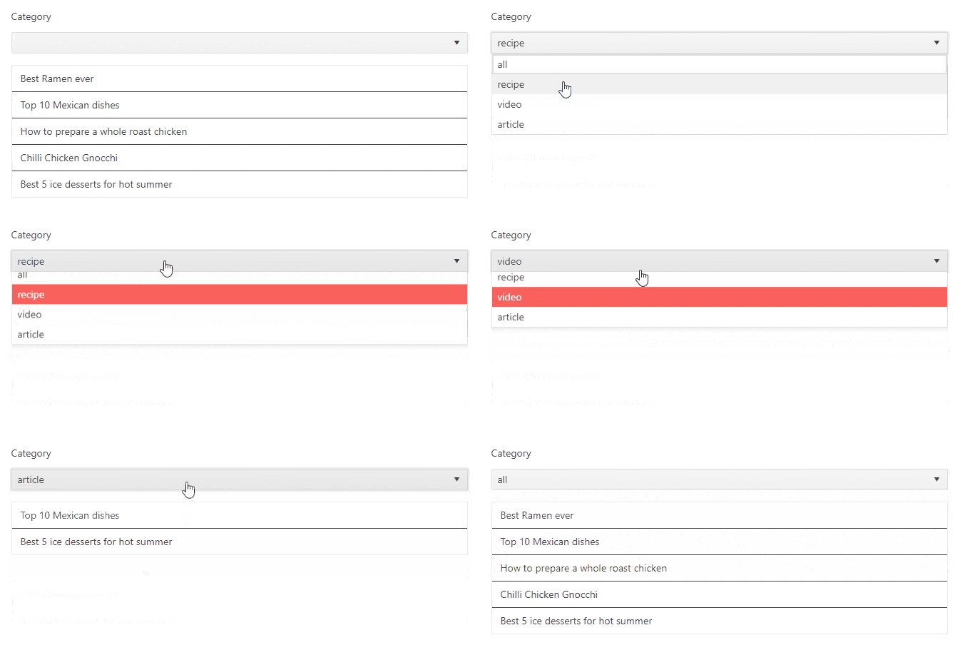
Below you can see the recipe dropdown in action.
React MultiSelect
MultiSelect, as the name suggests, is a select dropdown that allows a user to select multiple items. In the previous example, we created a select dropdown that allows a user to select one category.
However, there are scenarios in which it’s useful to allow users to select multiple items. For example, a tech blog platform could allow a technical writer to select technologies that are related to an article. Just look at this article. If I were to specify some tags for it, I would probably choose JavaScript, React and KendoReact tags. Now, let’s implement a multiselect.
src/components/MultiSelect/TagsMultiSelect.js
import { MultiSelect } from "@progress/kendo-react-dropdowns";
import { useState } from "react";

const tags = [
  "JavaScript",
  "TypeScript",
  "React",
  "Next",
  "Vue",
  "Nuxt",
  "Node",
  "Python",
];

export const TagsMultiSelect = () => {
  const [selectedTags, setSelectedTags] = useState([]);
  const onChange = event => setSelectedTags([...event.value]);

  return (
    <form className="k-form k-my-8">
      <label className="k-label k-mb-3">Related technologies</label>
      <MultiSelect data={tags} value={selectedTags} onChange={onChange} autoClose={false} />
    </form>
  );
};
Again, update the App.js file to render our TagsMultiSelect component.
src/App.js
// other imports
import { TagsMultiSelect } from "./components/MultiSelect/TagsMultiSelect";

function App() {
  return (
    <div className="App">
      {/* ...other components */ }
      <TagsMultiSelect />
    </div>
  );
}

export default App;
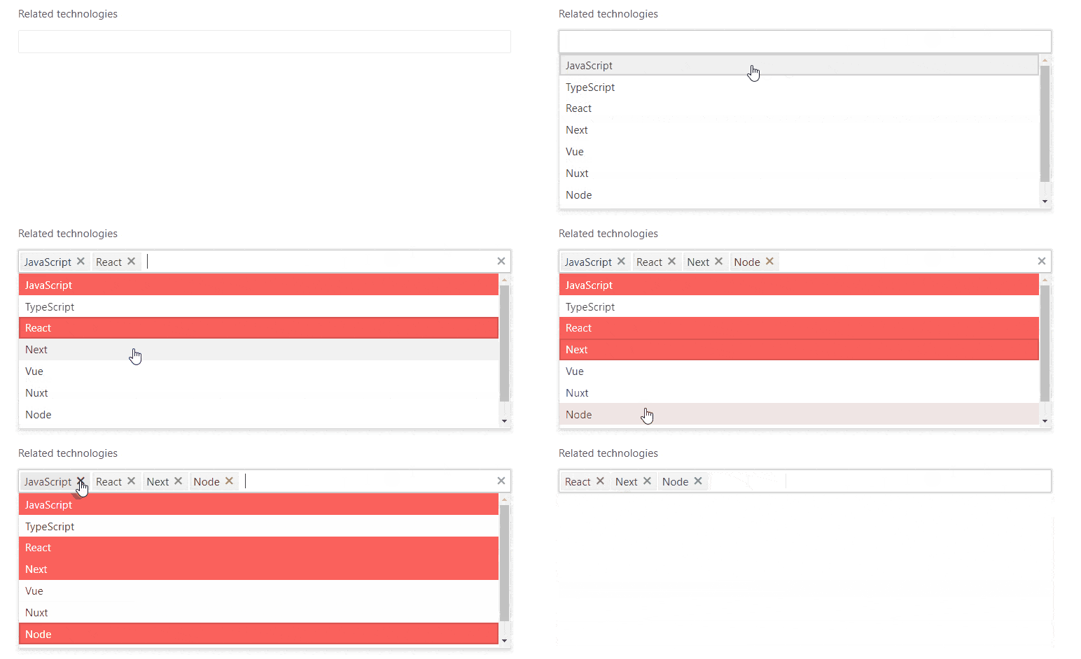
In the gif below, you can see the TagsMultiSelect component in action.
React AutoComplete
There are a lot of websites that ask users to provide their personal details and where they live. Very often, a form like that contains a dropdown which allows users to select the country they live in. First, create a new file that will contain all the countries.
src/components/AutoComplete/countries.js
// From https://bitbucket.org/atlassian/atlaskit-mk-2/raw/4ad0e56649c3e6c973e226b7efaeb28cb240ccb0/packages/core/select/src/data/countries.js
export const countries = [
  { label: "Andorra" },
  { label: "United Arab Emirates" },
  ...
  //Pull the full, very long list of countries from this file: https://github.com/ThomasFindlay/kendo-react-dropdowns/blob/main/src/components/AutoComplete/countries.js
  ...
  { label: "Zambia" },
  { label: "Zimbabwe" },
];
Let’s make use of these countries and create a new React AutoComplete component.
src/components/AutoComplete/CountryAutoComplete.js
import { countries } from "./countries";
import { AutoComplete } from "@progress/kendo-react-dropdowns";

export const CountryAutoComplete = () => {
  return (
    <form className="k-form k-my-8">
      <label className="k-label k-mb-3">Select Country</label>
      <AutoComplete data={countries} textField="label" suggest />
    </form>
  );
};
Now we can render the CountryAutoComplete in the App.js file.
src/App.js
// other imports
import { CountryAutoComplete } from './components/AutoComplete/CountryAutoComplete'

function App() {
  return (
    <div className="App">
      {/* ...other components */ }
      <CountryAutoComplete />
    </div>
  );
}

export default App;
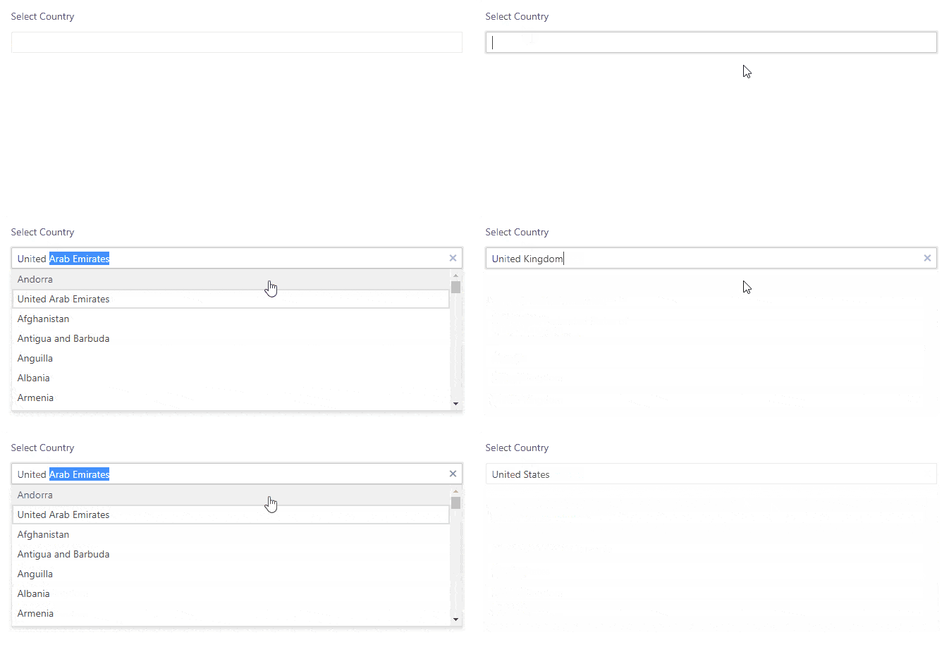
Below you can see the country autocomplete component in action.
React ComboBox
The ComboBox component is quite similar to the DropDownList component we used previously but allows users to type in it. It also provides additional functionality, such as grouping and suggestions.
Let’s use project management software as an example. When creating a new task, you can assign it to an employee in your company. However, if your company has a lot of employees, it would be useful to see which department they are in, so it’s easier to find assignees.
src/components/ComboBox/AssignessComboBox.js
import { ComboBox } from "@progress/kendo-react-dropdowns";
import { useState } from "react";

const assignees = [
  {
    id: 1,
    name: "Chloe Williams",
    occupation: "Developer",
  },
  {
    id: 2,
    name: "Severus Snape",
    occupation: "Developer",
  },
  {
    id: 3,
    name: "Mark Smith",
    occupation: "Tech Support",
  },
  {
    id: 4,
    name: "Rosemary Adams",
    occupation: "Tech Support",
  },
  {
    id: 5,
    name: "Joe McDonalds",
    occupation: "Designer",
  },
  {
    id: 6,
    name: "Minerva McGonagall",
    occupation: "Designer",
  },
];

export const AssigneesComboBox = () => {
  const [selectedAssignee, setSelectedAssignee] = useState(null);
  const onChange = event => setSelectedAssignee(event.value);

  return (
    <form className="k-form k-my-8">
      <label className="k-label k-mb-3">Task Assignee</label>
      <ComboBox
        data={assignees}
        value={selectedAssignee}
        onChange={onChange}
        textField="name"
        groupField="occupation"
        suggest
      />
    </form>
  );
};
Again, don’t forget to add it to the App.js component.
src/App.js
// other imports
import { AssigneesComboBox } from "./components/ComboBox/AssigneesComboBox";

function App() {
  return (
    <div className="App">
      {/* ...other components */ }
      <AssigneesComboBox />
    </div>
  );
}

export default App;
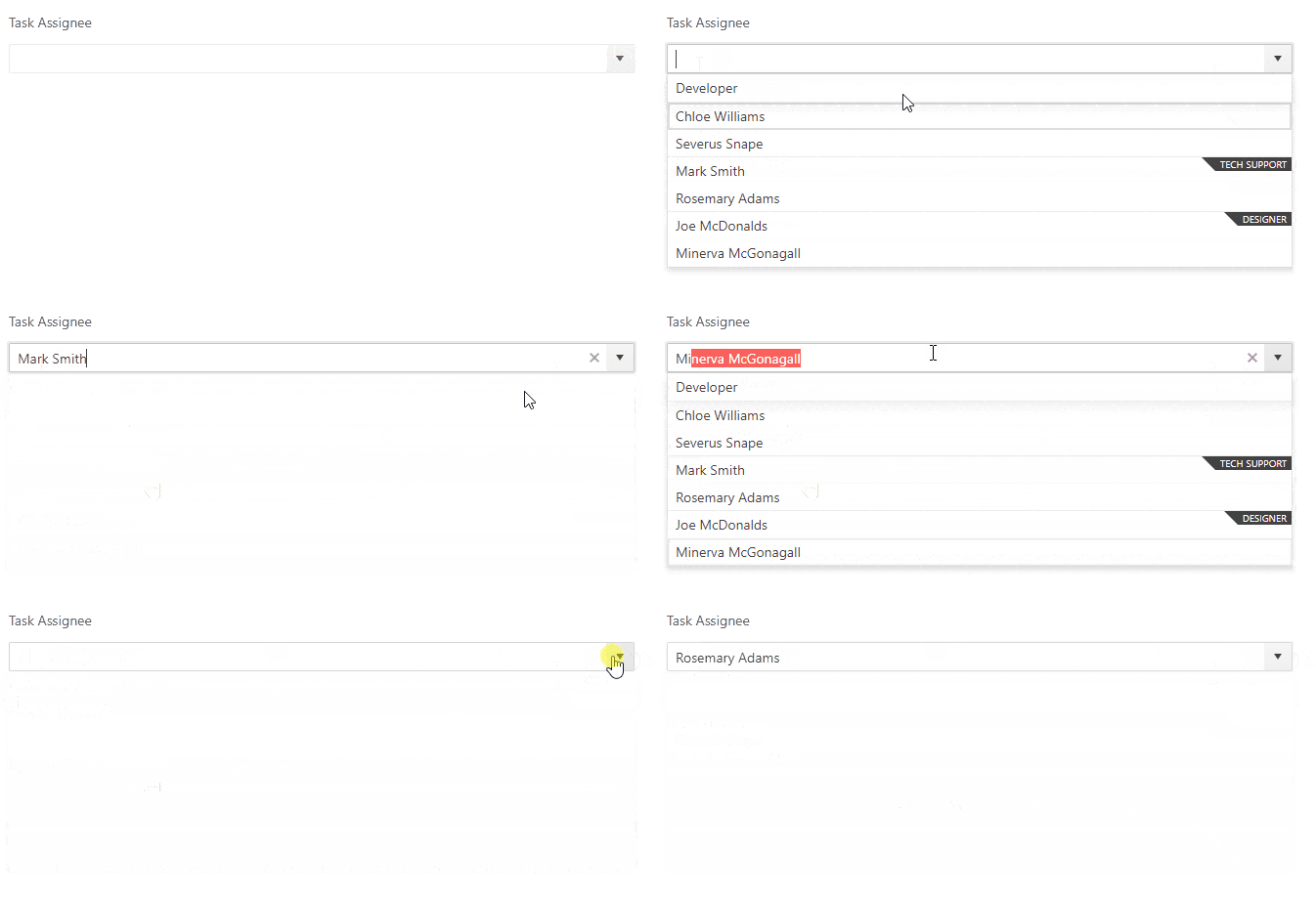
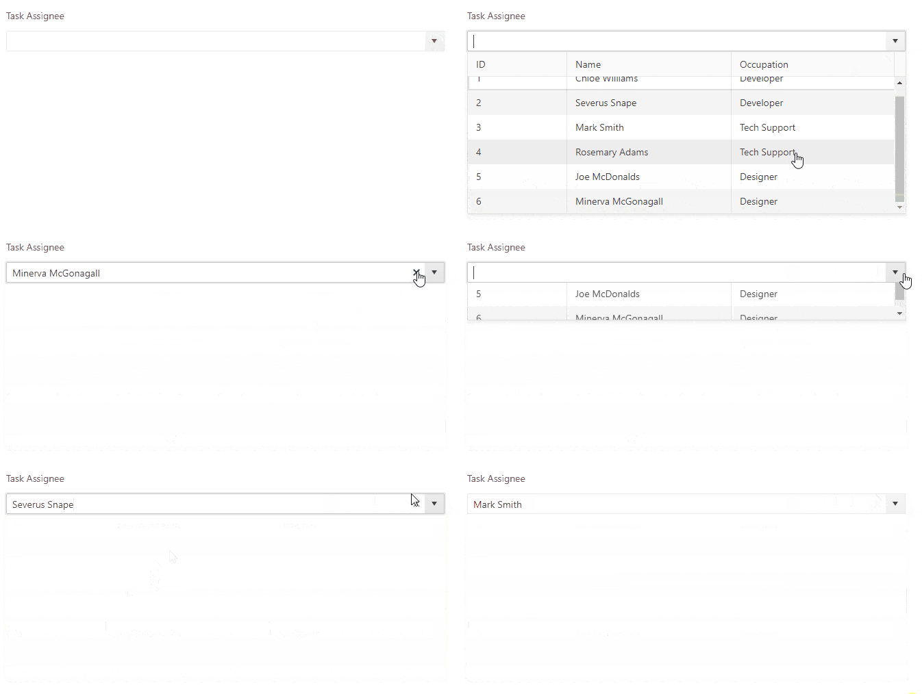
Below you can see how it works. Note the labels “Developer,” “Designer” and “Tech Support.”
React MultiColumnComboBox
The MultiColumnComboBox works like the ComboBox we implemented in the previous section, but it can display multiple columns in the dropdown. Let’s enhance the previous task assignee example and display all details: “id,” “name” and “occupation” in the dropdown.
src/components/MultiColumnComboBox/AssigneesMultiColumnComboBox.js
import { MultiColumnComboBox } from "@progress/kendo-react-dropdowns";
import { useState } from "react";

const assignees = [
  {
    id: 1,
    name: "Chloe Williams",
    occupation: "Developer",
  },
  {
    id: 2,
    name: "Severus Snape",
    occupation: "Developer",
  },
  {
    id: 3,
    name: "Mark Smith",
    occupation: "Tech Support",
  },
  {
    id: 4,
    name: "Rosemary Adams",
    occupation: "Tech Support",
  },
  {
    id: 5,
    name: "Joe McDonalds",
    occupation: "Designer",
  },
  {
    id: 6,
    name: "Minerva McGonagall",
    occupation: "Designer",
  },
];

const columns = [
  {
    field: "id",
    header: "ID",
    width: "9rem",
  },
  {
    field: "name",
    header: "Name",
    width: "15rem",
  },
  {
    field: "occupation",
    header: "Occupation",
    width: "15rem",
  },
];

export const AssigneesMultiColumnComboBox = () => {
  const [selectedAssignee, setSelectedAssignee] = useState(null);
  const onChange = event => setSelectedAssignee(event.value);

  return (
    <form className="k-form k-my-8">
      <label className="k-label k-mb-3">MultiColumn Task Assignee</label>
      <MultiColumnComboBox
        data={assignees}
        columns={columns}
        value={selectedAssignee}
        onChange={onChange}
        textField="name"
        suggest
      />
    </form>
  );
};
src/App.js
// other imports
import { AssigneesMultiColumnComboBox } from "./components/MultiColumnComboBox/AssigneesMultiColumnComboBox";

function App() {
  return (
    <div className="App">
      {/* ...other components */ }
      <AssigneesMultiColumnComboBox />
    </div>
  );
}

export default App;
React DropDownTree
Last but not least is the React DropDownTree component. It can be used to choose a single value from a hierarchical list. What is really interesting about this component, though, is the fact that it can be used to display a list of collapsible and expandable items.
Imagine a groceries website that allows an admin to assign food items to specific categories. For instance, an admin would be able to open a select dropdown that would have different categories like drinks and chilled food, as well as subcategories like water, juice or cheese. This is something we can implement with the DropDownTree component.
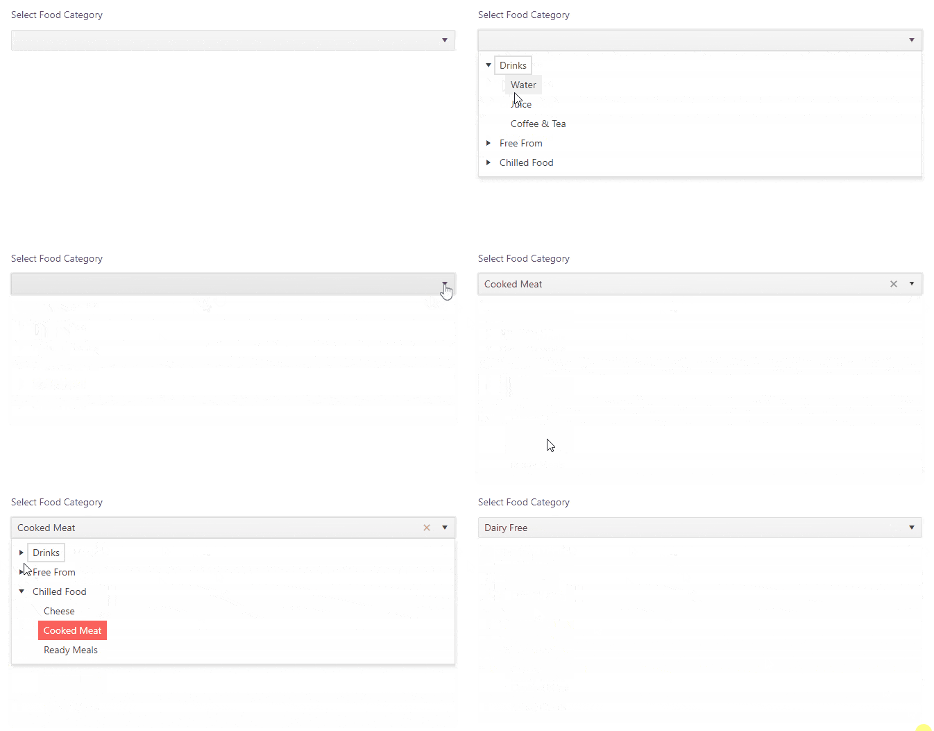
Here is the implementation. It requires a bit more code than previous examples and we need to use a few helper methods for managing expanded state and processing the dropdown tree data.
src/components/DropDownTree/FoodDropDownTree.js
import { useCallback, useMemo, useState } from "react";
import { DropDownTree } from "@progress/kendo-react-dropdowns";
import { processTreeData, expandedState } from "./treeDataOperations";

const data = [
  {
    id: 1,
    text: "Drinks",
    items: [
      {
        id: 2,
        text: "Water",
      },
      {
        id: 3,
        text: "Juice",
      },
      {
        id: 4,
        text: "Coffee & Tea",
      },
    ],
  },
  {
    id: 5,
    text: "Free From",
    items: [
      {
        id: 6,
        text: "Gluten Free",
      },
      {
        id: 7,
        text: "Dairy Free",
      },
      {
        id: 8,
        text: "Lactose Free",
      },
    ],
  },
  {
    id: 9,
    text: "Chilled Food",
    items: [
      {
        id: 10,
        text: "Cheese",
      },
      {
        id: 11,
        text: "Cooked Meat",
      },
      {
        id: 12,
        text: "Ready Meals",
      },
    ],
  },
];

const selectField = "selected";
const expandField = "expanded";
const dataItemKey = "id";
const textField = "text";
const subItemsField = "items";
const fields = {
  selectField,
  expandField,
  dataItemKey,
  subItemsField,
};

export const FoodDropDownTree = () => {
  const [value, setValue] = useState(null);
  const [expanded, setExpanded] = useState([]);

  const onChange = event => setValue(event.value);

  const onExpandChange = useCallback(
    event => setExpanded(expandedState(event.item, dataItemKey, expanded)),
    [expanded]
  );

  const treeData = useMemo(
    () =>
      processTreeData(
        data,
        {
          expanded,
          value,
        },
        fields
      ),
    [expanded, value]
  );

  return (
    <form className="k-form k-my-8">
      <label className="k-label k-mb-3">Select Food Category</label>
      <DropDownTree
        data={treeData}
        textField={textField}
        onChange={onChange}
        dataItemKey={dataItemKey}
        selectField={selectField}
        expandField={expandField}
        onExpandChange={onExpandChange}
      />
    </form>
  );
};
src/components/DropDownTree/treeDataOperations.js
import { filterBy } from "@progress/kendo-react-data-tools";
import { mapTree, extendDataItem } from "@progress/kendo-react-common";

export const processTreeData = (data, state, fields) => {
  const { selectField, expandField, dataItemKey, subItemsField } = fields;
  const { expanded, value, filter } = state;
  const filtering = Boolean(filter && filter.value);

  return mapTree(
    filtering ? filterBy(data, [filter], subItemsField) : data,
    subItemsField,
    item => {
      const props = {
        [expandField]: expanded.includes(item[dataItemKey]),
        [selectField]: value && item[dataItemKey] === value[dataItemKey],
      };
      return filtering
        ? extendDataItem(item, subItemsField, props)
        : { ...item, ...props };
    }
  );
};

export const expandedState = (item, dataItemKey, expanded) => {
  const nextExpanded = expanded.slice();
  const itemKey = item[dataItemKey];
  const index = expanded.indexOf(itemKey);
  index === -1 ? nextExpanded.push(itemKey) : nextExpanded.splice(index, 1);

  return nextExpanded;
};
Lastly, add the component in the App.js file.
src/App.js
// other imports
import { FoodDropDownTree } from "./components/DropDownTree/FoodDropDownTree";

function App() {
  return (
    <div className="App">
      {/* ...other components */ }
      <FoodDropDownTree />
    </div>
  );
}

export default App;
Wrap-up
That’s it! I hope you enjoyed this quick guide to dropdown menus with React. There are many use cases for dropdowns, and they are one of the most commonly used features on the web. We have covered how commonly used websites incorporate dropdowns and implemented six different React dropdown examples for real-life scenarios.
KendoReact offers a lot of feature-rich components that can be easily used for implementing a variety of features. Make sure to check out the React DropDowns documentation for more examples. You can find the full code for this tutorial in this GitHub repo.

Thomas Findlay
Thomas Findlay is a 5-star rated mentor, full-stack developer, consultant, technical writer and the author of “React - The Road To Enterprise” and “Vue - The Road To Enterprise.” He works with many different technologies such as JavaScript, Vue, React, React Native, Node.js, Python, PHP and more. Thomas has worked with developers and teams from beginner to advanced and helped them build and scale their applications and products. Check out his Codementor page, and you can also find him on Twitter.
