

We used to argue about dividing our components into categories, until we renounced this pattern as a community. But what if we missed out on valuable lessons about what makes our components more comprehensible?
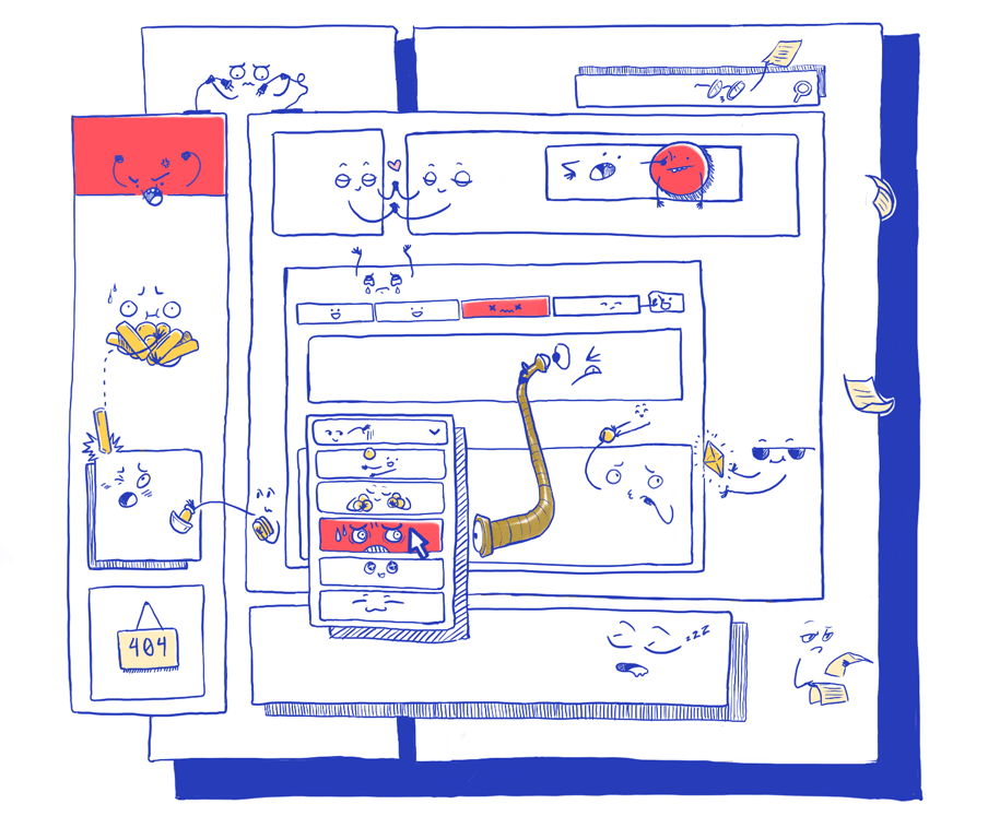
While components were not a new invention by any stretch of the imagination, when the community came around to React a lot changed. Building componentized apps with React didn't just feel better, it also proved to help us create more solidly built apps. It also enabled developers to think of components as a smaller abstraction on which to build more abstractions. But as we explored the boundaries of components we still found ourselves in familiar situations when large codebases started to become less comprehensible over time.
This was the perfect breeding ground for meta discussions. Every month the React community used to discuss a new problem that needed solving. Many rules were written to find answers and guide teams towards building more comprehensible codebases. In the end, a lot of these practices and opinions have been pushed aside. As the community iterated on some of the earlier discussions, many patterns and rules are now understood as a matter of taste and preference, while others are outright obsolete. And despite the lack of rigid rules, these days React codebases mostly turn out alright.
Of course, some common advice and guidance is welcome for beginners, but the discussions we all once held so passionately (à la "By what criteria do we group our files?") are now much more toned down. The mantra is, as long as a codebase follows consistent patterns, we will manage.
However, a once furiously held discussion stands out: How do we divide our components into separate categories?
"How to Component?" reinvented again and again
Components don't have any natural limitations. We may write components that objectively are too large, too small, too nested, or are otherwise too complex.
This started a discussion on how to set a new rule to writing components, which would limit how we write them. This rule is one of the more infamous React patterns. You may know it as "Dumb and Smart Components," or as "Presentational and Container Components," or even later simply as "Stateful and Pure Components." A rule to intentionally separate components by their responsibilities.
Circa 2015, Dan Abramov, now part of the React core team, wrote about this pattern as well, as it proliferated in popularity:
"You’ll find your components much easier to reuse and reason about if you divide them into two categories."
This distinction became so forced and accepted that more patterns were enabled by it and created on top. The peak of this pattern came when Kent C. Dodds released Downshift, which extended the general idea of this pattern with "render props."
But, as quickly as these patterns proliferated, they lost their popularity over time until React Hooks delivered the coup de grâce, and the pattern disappeared entirely. It simply didn't feel natural to artificially establish a boundary between state driving the presentation, and the presentation's code itself right from the start of writing a component. Since components embraced composition and building up UIs and apps with small building blocks, arbitrary rules like these didn't lead to more comprehensible code.
Other shifts in the community contributed to the inevitable downfall of the "container & presentational component" pattern as well. While this pattern was already on a slow but steady decline, styled-components gained in popularity. This started a shift in perspective amongst the React community even before React Hooks were introduced as it changed how "presentational components" are written in the first place. Suddenly it became clearer how styling and structure are already separate in componentized apps.
The changes in how we styled our apps, the advent of function components, and lastly, the introduction of React Hooks, all demonstrated the shortcomings of applying the "presentational and container component" pattern explicitly.
Why we seek constraints where there are few
As a community, we clearly feel strongly about good React development but find the codification of reliable categorization elusive. We struggled to differentiate between what patterns would serve us and which ones were arbitrary, and saw many examples of both. Time has given us a better perspective on what is obsolete and what we like or dislike. Developments on React itself such as Hooks and the React Context API were direct responses to enhance developer comprehension while still encouraging composition. But as for the principles we can and should apply to every component we write, we are left constrained only by the small set of rules that React imposes on us.
React imposing very few constraints may seem just as much to be a blessing as it is a curse, shown by patterns like the "presentational and container components" disappearing almost as quickly as they appeared. This may seem counterintuitive, even in the context of architecting a React application, but we seek constraints because constraints are at the core of designing anything.
Let's say you were asked to draw something — anything. Just a simple drawing, no constraints. Your mind may be blank while you search for something meaningful to draw. But if you were asked to draw an animal, you may find an idea nigh instantaneously that's both thematic and personal. A single constraint provides the difference. But while this is just a thought experiment that isn't true in every case; some research shows that people are more innovative when working with well-chosen constraints*.*
An inkling of something great in a failed idea?
Applying too many rules to React codebases can be detrimental to a team's success. That much is clear — albeit, consistency still being important for new readers of a codebase to know what to expect without having to scan the whole thing. However, what if components don't fit neatly into the two categories we dreamt up back then, but that the categories themselves do in fact exist? Could we understand these responsibilities of components as a discovered and self-emerging pattern rather than an imposed pattern or rule?
While React Hooks, styled-components, and more styling, state management and data libraries (like GraphQL clients!) are entering the picture, it's clear that terms like "presentational components" and "structural components" have remained an unchanged fixed constant. If we look at Input or Button components rendering a single piece of UI, we can clearly identify them as "presentational." Similarly, a component that accepts API data and passes it on to other components is clearly "structural" in nature, and when API request logic is added to a component it becomes "stateful" in nature.
Hence, in theory while we don't actively constrain ourselves to these categories, we do in fact find that components seem to generally fit into three distinct classes:
- Presentational Components
- Structural Components
- Stateful Components

Presentational components emerge quickly when we build component libraries, as typically all components in a component library can be understood to be built to be reusable and purely presentational, agnostic to what API or application state they're rendered with. They may abstract our styles and theming, concern themselves more with our users' interactions with the app, and provide a thin API layer to be used in other components.
Structural components are seen whenever we think of "screens," "views," or "pages." These components emerge as we compose presentational components into a structure that represents our app's views and will often distribute our backend's data throughout the app. They compose presentational components and are hence a mapping of our business logic and application state and data.
Lastly, every app will have places where it integrates backend data and business logic, which can be generally understood as state. This state is different from our presentational components' local state and instead is made up of backend data and API calls that are integrated into our views.
These three categories and descriptions of separate responsibilities can be applied to any componentized app and are a discovered pattern rather than an imposed one — meaning, that we're not saying we need to write components to fit these categories, but that components organically show characteristics of them. This also means that these are very loose definitions and chances are if you were to look at any given React app right now, you may find a couple of components that are taking on two responsibilities simultaneously or are hard to immediately categorize. We must accept that without this being a strict rule, some components may not always fall neatly into these three categories.
Stateful, presentational, and structural components are fluid classes that we can assign our components to and describe them with.
A degree of reusability for components
Since not all components will strictly fall into these separate categories, we can alternatively think of them as being on an "axis of reusability" instead. This describes a spectrum of our components instead by how reusable they are.
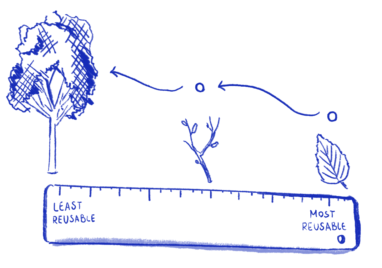
On one side we find our least reusable components, which we'd previously call stateful components. Stateful logic fetches API data, maintains global application state, and maintains business logic. This logic is the "most specific" part of our application as it's unique to the application we're building. While their logic may be further subdivided and abstracted (for instance with Hooks or Redux) stateful components are purpose-built and only show up once.
On the opposite side of this axis is where we find our most reusable components. The hallmarks of these components are that they're presentational and could be used in multiple parts of the app or even other apps. If we're working with a component library then the components in it will certainly be reusable.
Some components are towards the middle of this axis as they'll be specific enough to accept some state or API data and pass it on to presentational components, but may also be used in several places as they aren't responsible for retrieving state or data themselves — hence they're the structural components.
A few components may also have "mixed responsibilities," which happens when components are yet to be split up and will be anywhere along this axis.
If we were to place an app's components onto this axis, chances are that we find less reusable components at the top of the component tree, while towards the bottom we find more reusable components. This happens naturally due to how components are composed. Because stateful components are by definition wrapping larger parts of our application they're at the top. Corollary presentational components are at the bottom as they'd only render other presentational components.
How do we know that something's gone wrong?
Imagine this: You're working on a large and complex React app and have done a lot of research and planning, have set up a component library, written nice providers and hooks for your backend data fetching, have split your app into views and pages beforehand, and have put time and careful planning into the architecture of this app — but after a few weeks your team still finds themselves with a handful of components and parts of your app that don't feel right. Sound familiar?
In this case, you may have found yourself with some "bad components" suffering from poorly chosen constraints, which are often not further analyzed and instead called "hard to understand" or just "tech debt."
Multiple signs lead us to believe that a component is bad. They may be too specific and tend to break if you remove them from their intended place, or they aren't as reusable as intended. On the other hand, some may be too generalized, which hinders comprehensibility and decreases their chance of being reused overall — a common issue with render props, which at its extreme appears reminiscent of Node.js' callback hell.
Some components may or may not have an optimal interface or API. As props are our components' inputs, they are what makes components composable, which influences how and if they'll be reused. A component with a suboptimal interface will also lead to poor code in its parent components.
As we can see, there's a wide variety of reasons a component could be bad. However, oftentimes components simply become more complex, which is one of the hardest problems to rectify. Complex components often build up a large amount of dependencies and are discovered once we start testing them.
These are all subjective and vague factors. But, we can use a more nuanced definition of complexity and combine it with our understanding of classes of components to arrive at more actionable problem statements.
Problems that the "axis of reusability" helps us identify
Complexity is a factor of information scale (how much information), information diversity (how many elements), and information connectedness (how many cross-relationships between elements).
The component categories we've identified help us understand which components have overstepped an appropriate level of complexity by looking at how wide of a space they occupy on the axis of reusability. Complexity in this case it not only determined by how many pieces of information the individual component handles, but also grows exponentially if a given component falls into multiple categories, for instance if a component is structural and stateful at the same time.
Assuming that complexity arises from three factors, we can also derive that there are three general problems that we can identify "bad components" as being afflicted by:
- A component may have too many responsibilities — in other words, it occupies a breadth of the component axis that is too wide, by incorporating both structural and presentational responsibilities, or stateful and structural responsibilities.
- A set of components may have been split awkwardly — for instance, a presentational component may have not been written to be less specific and instead isn't truly reusable. Two components that are used together may share too much information about one another, which may make both harder to read and reuse.
- A component may be "surrounded" by others that are in a skewed place of the axis in the component tree. This may happen when a presentational component renders a structural or stateful one, which complicates the relationships of all components in this path and forces us to reach for React's Context API too early for the sake of avoiding prop drilling in places where it isn't appropriate anyway.
The categories and hierarchies of components in componentized apps often matter more than the individual implementation details of a component. How components interact with each other combined with what we require them to do directly dictates how they'll be implemented, which gives us a new tool to identify bad components.

If it ain't broke...
While we've looked at identifying and classifying these problems, which shows that they are absolutely avoidable and fixable, it's hard to impose strict rules on a codebase to prevent them in the first place.
Not all components start out bad. At times, a "good component" may get hijacked for a problem it was never intended to solve, and instead of composing it with more structural components to add functionality, we edit it directly. "Bad components" are often under the influence of constraints as much as good components are— the difference is which constraints have been given significance.
Time and energy are constant constraints too. It takes time to write unit tests, which can help us check for our mistakes and demonstrate the component's interface. It also takes more time and mental energy to take stock of a feature before it is implemented and break it down into its different states and concerns. It is also not a casual thing to "just implement a design system" so that a project can be served by good, well-behaved atoms that your app can reuse.
It may be more important that we recognize what makes a good or a bad component, rather than being able to define what not to do.
How common are these problems?
While the first two categories of problems we've identified are very useful for isolated sets of components, it's the latter problem of the "surrounding structure" that tends to creep up slowly. Since identifying problems in component structures requires a high-level overview, simple additions may end up creating problems far down the line.
Presentational components are very isolated pieces of our application that render UI elements with simple interfaces and props, but at the same time, styling and data make up most of our applications. At times, we may not be set up for success as an application grows, and it becomes harder to justify large refactors as time is a constant constraint.
In a growing project, it's too easy to lose track of all component hierarchy and add presentational logic to any given part of our application, or render new non-presentational components inside a previously presentational one. It's always just as easy to add new logic to the right place as it is to the wrong place.
Luckily, React has a host of libraries that were solely created to improve the Developer Experience ("DX" for short) of writing applications in React. These libraries add additional constraints and layer APIs into our workflows and are aimed at making it easier for us to "do the right thing." However, even given these libraries' additional constraints it's actually just as likely to find ourselves in situations where we create structural problems, as these libraries abstract styling and state management code (and make this code more effortless to write), but what causes these problems sticks around.
The Styled Components pattern
styled-components has become a well known library to alter the workflow of countless React developers when it comes to styling. While it allows us to create "micro components" that are only responsible for attaching CSS rules to a given element, the library also comes with a higher-order component pattern, styled(Component). This function usage of styled allows us to add styles to any component that accepts the className prop and passes it on to a DOM element. This is a convenient pattern to extend presentational components with some additional styling code.
However, sometimes we're only a small step away from adding this to structural components too, which then pass the className property on to a presentational component. This small difference traps us in situations where we add styled presentational logic above a structural component, which blurs the line between structural and presentational components.
Initially this may feel like an insignificant compromise — our presentational components remain highly reusable and our structural components override any styled as needed. However, this severely alters our expectations as to where we can find presentational code in the first place; both, in the browser's cascading styles, and in our codebase's component trees.

Prop drilling and React Context
Since the introduction of useContext, the React Context API is more powerful than ever. But its new Hooks API made it quicker than ever to add context to any component. Unfortunately, Context can also be used to disguise the complexity of a set of components or set up bad component hierarchies. Primarily, this can be seen in its two most common use-cases:
- It can be used to transfer a store-like object to any part of our application, which manages updates separately or is a store that abstracts a whole category of data.
- It can be used to package up and transfer any data directly to a part of our application, without an intermediary store.
The latter is often used to avoid "prop drilling" in an application. When an application contains a large amount of data in a given subtree, a developer must pass several props and pieces of data through multiple structural components until it reaches their presentational components.
Prop Drilling isn't inherently bad as it's defined as data flowing through our application's tree from top to bottom and is hence a natural part of any React app. However, when structural components are wrapped and "interrupted" in the tree by other types of components, managing prop drilling can become tedious. The term is often used once there are props to manage in components that seemingly don't care about these props and just pass them on.
Using Context to wrap data up is a symptom of this problem, as it's then used to "skip" several levels of structural components, instead of passing props. Structural components may then pass on what's left or only represent what's being rendered. While this may make some component APIs seemingly easier to read on the surface, it may often simply obscure a component's data dependencies instead.
While this pattern is certainly useful, it's also an example of circumventing the constraints of component structures. In many cases, composed structural components and type structures for props can prevent this from becoming necessary in the first place. When our API data flows through a view from top to bottom and other state is as close to where it's consumed as possible, this pattern starts to not look as useful anymore.
The hallmarks of good components
By now we've described several key ideas that hopefully help you gain new tools to identify why a set of components in your app may not be as readable as they could be.
We've identified that understanding components as more or less reusable, and as stateful, structural, or presentational helps us identify when we're overloading a component with too many responsibilities, and when we're disrupting our carefully set up component structures.
We've identified that keeping complexity of individual components below a threshold is extremely important, especially when it comes to creating presentational components with simple interfaces and props.
However, in not having set any rules identifying the opposite has remained just as difficult. What makes a "good component?"
Design systems and good components
Identifying and creating "good components" is a trickier process than identifying patterns of "bad components." After all, when we identify potential problems in our component structure and API, we're only looking at a limited list of problems. In contrast, when we attempt to define "good components" these aren't simply the opposite but must conform to our personal requirements and the needs of our apps. In short, a good component finds a balance of constraints while remaining reusable and integrating cleanly into the rest of our application — which will make it a different definition depending on the circumstances.
While this sounds vague, we frequently define custom constraints when we create component libraries and design systems in React. A design system creates components that narrow dimensions of usage (typically props) to a limited set of inputs. In such a system we, for instance, narrow down all possible APIs and instead of designing any button, we'll design just "our button".
This can be contrasted with libraries that do attempt to make components for a multitude — if not any — possible usage and app, like Downshift. The problem with abstracting a UI element for any possible use-case is that it creates much larger dimensions that the library's API has to manage and control.
However, no matter how complex this field of dimensions is, presentational components can always be composed to limit these dimensions based on our usage. If we were to use Downshift in an app, we'd be inclined to wrap it and narrow down its API for our specific use-cases. Similarly, as we're integrating presentational components into our app we're composing and wrapping them with structural components that transform our data and state as needed for them. If done right, components form multiple, nested abstractions at every level.
Good components are our components
Even as we're creating components for the application we're working on, we're often concerned with creating components that work in any part of any app we may create in the future. However, our applications have a unique shape, unique state, and unique look. If we think of our components as always having to handle one more page, we run the risk of making any component too complex rather than focusing on their structure for where they're currently needed.
Many of the problems in this article are avoidable given time when several components' interfaces and structure get out of hand, or given enough constraints from our own requirements.
Not all components are created equal, but no component is used in isolation.