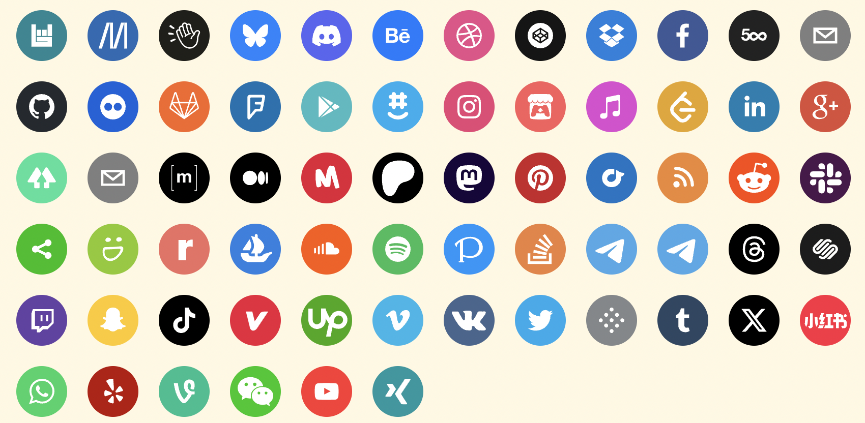
A set of beautiful svg social icons. Easily used in React. No images or external css dependencies. Example
npm install react-social-icons
yarn add react-social-icons
pnpm add react-social-icons
Pass in the url prop of your social network, and the icon will be rendered.
import React from 'react'
import ReactDOM from 'react-dom'
import { SocialIcon } from 'react-social-icons'

const Component = <SocialIcon url="https://twitter.com" />
// React v16
ReactDOM.render(Component, document.body)
// React v17+
ReactDOM.createRoot(document.body).render(Component)
See more usage options on the example site.
This library supports TypeScript since v5.2.0. (type declarations)
Reduce the size of bundled code from this library by importing the SocialIcon
component directly and only importing the icons you need. Bundled code using
only one icon will be many times smaller. Most icons are only a few hundred
bytes in size without compression, which shrinks them another ~30%. The size of
the bundled library will scale linearly with each icon you import. Many
bundlers will tree shake the unused icons from the final code-split bundle.
import { SocialIcon } from 'react-social-icons/component'
import 'react-social-icons/vimeo'
import 'react-social-icons/meetup'
// renders: vimeo icon
<SocialIcon url="www.vimeo.com" />
// renders: meetup icon
<SocialIcon url="www.meetup.com" />
// renders: default icon
<SocialIcon url="www.pinterest.com" />| Property | Type | Required | Description |
|---|---|---|---|
| url | String | No | The rendered component will link to this url and show the social network's icon. |
| network | String | No | Override which network icon to render |
| bgColor | String | No | Override the background fill color (defaults to social network's color) |
| fgColor | String | No | Override the icon's fill color (defaults to transparent) |
| label | String | No | Set the aria-label attribute on the rendered anchor tag (defaults to the social network's name) |
| className | String | No | Specify a class to attach to the rendered anchor tag |
| style | Object | No | Override style properties passed to the rendered anchor tag |
| href | String | No | Override the link while keeping the icon matching prop url |
| as | String | No | Override the root element of the component (defaults to 'a') |
| fallback | String | No | Specify the icon shown when no network matches the url prop |
Sets the link the anchor element points to and renders the icon associated
with the network matching the url.
// renders: vimeo.com
<SocialIcon url="www.vimeo.com" />Overrides the icon rendered by the component.
// renders: github icon
<SocialIcon network="github" />

// renders: github icon
// on click: navigate to vimeo.com
<SocialIcon network="github" url="www.vimeo.com" />Overrides the background or foreground fill colors. Defaults to the network's brand color (bg) and transparent (fg).
// renders: default icon
<SocialIcon bgColor="green" fgColor="blue" />Overrides the ARIA attribute on the anchor element. Defaults to network name.
// renders: vimeo icon
<SocialIcon label="my video channel" url="www.vimeo.com" />
// or
<SocialIcon aria-label="my video channel" url="www.vimeo.com" />Specify a CSS class and styles for the anchor element. Read more about these special React props.
<SocialIcon className="colorscheme" style={{ color: 'green' }} />Overrides the anchor link. Ignored when the component decides what icon to render.
// renders: default icon
// on click: navigate to github.com
<SocialIcon href="www.github.com" />
href specifies the anchor link while url specifies the rendered icon
// renders: vimeo icon
// on click: navigate to github.com
<SocialIcon href="www.github.com" url="www.vimeo.com" />Set <SocialIcon> to be any html element you want. Defaults to 'a'.
<SocialIcon as="div" />Overrides the default icon shown when a network does not match the given URL.
Accepts a network:
<SocialIcon fallback="pinterest" /> // renders pinterest iconOr an icon definition:
<SocialIcon fallback={{ color, path }} /> // renders custom iconThere are other useful functions and objects exported from the SocialIcon library.
A function that accepts a url string and returns the matching social network domain name.
import { networkFor } from 'react-social-icons';
import { assert } from 'assert'
assert.equal(networkFor('https://www.pinterest.com'), 'pinterest')A function that accepts the domain name of a social network with an object
definition of the icon's paths and color. It will register the social network
icon with the <SocialIcon> component, which will have gained the ability to
render the icon for your social network, and update uri_regex to match the
domain name.
import { register } from 'react-social-icons';
register('mynetwork', {
  color: 'red',
  path: 'path commands' // see https://developer.mozilla.org/en-US/docs/Web/SVG/Attribute/d#path_commands
})A map that associates social network names to the icon objects with the network's color and icon paths.
import { social_icons } from 'react-social-icons'
import assert from 'assert'
assert.ok(social_icons instanceof Map)
network_names is a set that stores all the registered social network domain
names. getKeys returns an array of the same information.
import { network_names, getKeys } from 'react-social-icons'
import assert from 'assert'
assert.deepEqual(getKeys(), [...network_names])
assert.ok(network_names instanceof Set)A regex for urls that will match any social network domain names that are
registered. (this will not match mailto: links or return the default network,
use networkFor instead)
import { uri_regex } from 'react-social-icons'
import assert from 'assert'
assert.equal(uri_regex.exec('https://www.pinterest.com')?.[1], 'pinterest')Contributors are welcome. See CONTRIBUTING.md.
Pass the prop target like so: <SocialIcon target="_blank" url="www.vimeo.com" />. All props are forwarded to the underlying element, an
anchor.
This package packages exposes the component code and icon definitions in separate files with a simple import interface. There are several useful tools that implement features like tree-shaking to reduce the size of bundled code. Certain browsers contain features that let you important un-bundled code directly. An effort has been made to keep distribution code files simple, separate, and small.
Refer to a list of compatible browsers and import files directly from your own servers or a CDN.
Webpack and Rollup will tree shake any unused code from this package when you are bundling your code.
Follow the instructions in CONTRIBUTING.md.
There are a couple approaches to changing the color of the icon on hover. These can be modified to fit your particular use case by examining what attributes are on the underlying HTML element.
In a stylesheet, apply two fills to the social icon. One by default, and one on hover.
/* file: app.css */
.custom-class .social-svg-icon {
    fill: green;
}
.custom-class:hover .social-svg-icon {
    fill: red;
}
In your component, set the fgColor prop to currentColor to inherit colors
from the stylesheet rather than the inline style rule from the component.
// file: app.js
<SocialIcon className="custom-class" fgColor="currentColor" />You can override the fill color by using the !important CSS declaration
/* file: app.css */
.social-svg-icon {
    fill: green !important;
}
And simply use the icon like normal.
// file: app.js
<SocialIcon />Specify the network prop of the social network icon you want to render. For example:
<SocialIcon network="mastodon" url="https://techhub.social/" />
// or
<SocialIcon network="misskey" url="https://misskey-hub.net" />
Federated/decentralized social networks can have instances or user accounts
hosted on different domains. This can cause the library to not detect the
proper network on a naive inspection of the url prop. Refer to the
documentation on props.
When importing react-social-icons/component in a Typescript project, if your
tsconfig.json is misconfigured you may run into the error message TS2307: Cannot find module 'react-social-icons/component' or its corresponding type declarations.
To fix the issue, set "moduleResolution" in your tsconfig.json to
"bundler".
The error occurs when the "moduleResolution"
property
in your Typescript configuration is set to some variant of classic, or
node. Tree-shaking is a strategy of Node.js builds targeting a browser
environment. They take advantage of a bundler feature provided by tools like
webpack or
rollup. If you are using
react-social-icons in a project targeting a non-browser environment, you
should use the .cjs build of this package, which will be resolved
automatically if you import from react-social-icons in your project.
// in server projects ("moduleResolution": "node" or "classic")
import { SocialIcon } from 'react-social-icons'
// in browser projects ("moduleResolution": "bundler")
import { SocialIcon } from 'react-social-icons/component'
![@dependabot[bot]](https://avatars.githubusercontent.com/in/29110?s=64&v=4)